Projects I led
A Worlwide Redesign: Mobile-First Master Template for 70 Countries
L’Oréal ParisFull Accessibility: UI Design for an Indie Narrative x Management Game
Flat EyeFrom Concept to Wrist: Crafting an Apple Watch App
FastyAn intranet that reflects internal change within a company
The New York TimesDownload-Free Augmented Reality App for Exhibition Experiences
Glazer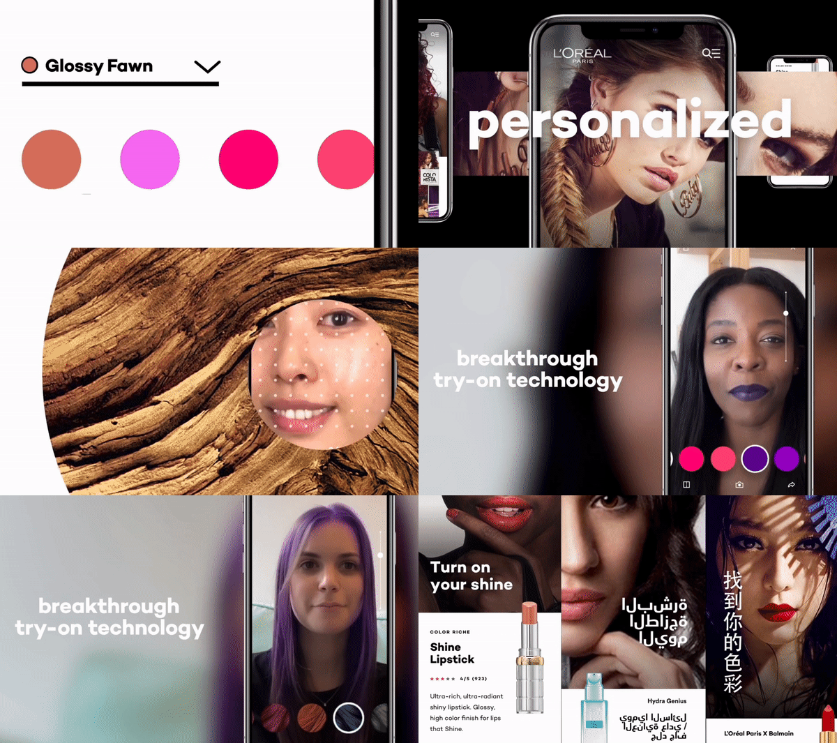
L’Oréal Paris
Lead UX
Flat Eye
Lead UI
Fasty
Co-Founder
The New York Times
UX Consulting
Glazer
Co-Founder
My timeline
2025
Witchspire
–2025
Pomod’hero : an Accessible Study Timer
Download app2025
KAI Go
–2024
Conference for DHL
–2024
Computershare
–2024
KGIS
–2024
PopScreen
–2023
Contexte Scan
–2023
NDA crossword game
Password protected2023
Fasty
View project2022
Flat Eye
View project2022
Flat Eye : Focus Tech Tree
View project2022
Conference + Mentoring at Gobelins
–2021
Glazer
View project2021
Balenciaga
View project2021
Air Liquide
–2021
Tasmane
Download extract2020
Gladiabots
View project2020
La Philharmonie de Paris
View project2019
Walk in Bangkok
View project2019
Zappos Kids
Website2019
IKEA
View project2018
The New York Times
View project2018
L’Oréal Paris
View project2018
Formula 1
–2018
WeChooz
Website2018
Campusea
View project2017
Dr. French
–2017
Make.org
–2017
Van Cleef & Arpels
–2017
Sonia Rykiel
View project2017
Raffles
–2017
Barnes Foundation
View project2017
Skillee to Comet
View project2017
Inato
–2017
Crédit Agricole CIB
–2017
BPI – Le Hub Digital
Website2016
Radio Classique
Website2016
Red Bull Kumite
–2016
PMU
–2016
Dior
–2016
Pops
–2015
Le Bon Coin (L’atelier)
–2015
Carglass
–2015
France Télévisions
Read article2015
L’Oréal Professionnel
–2014
Ecofolio – Le Bon Geste
–I gave a conference on User Research, focusing on the benefits of gathering feedback and its critical role in product design. To make the session interactive and immediately demonstrate the value of feedback, I incorporated a live feedback loop during the conference itself.
By asking attendees to share their thoughts on the tone and content as the talk unfolded, I highlighted how quick feedback can drive successful iteration—just as it does in product design. It turned into a real-time case study on the power of listening, adapting, and improving.
I won and led the project to adapt Computershare’s global brand guidelines for the Hong Kong market. This included localizing font adaptations, creating market-specific templates for their team, and designing a mascot to support future branding efforts in the region.
I joined the project amidst a scoping and client satisfaction crisis, taking the lead in rebuilding trust and aligning priorities through a workshop with the client. My contributions included redesigning an improved user flow, ensuring the quality of deliverables, and maintaining clear communication with the client.
The project focused on creating an embedded app experience for first-time mutual fund investors, featuring custom animal illustrations to represent different investor archetypes.
UX Audit for one of their video game
Contexte Scan is a legislative tracking software around public affairs.
I helped the company rebuild the product from scratch in a user-centric process after a first launch attempt.
The product was successfully launched in 2021.
I led the visual design for a crossword game prototype.
1 month of production, designing the main game of the flow, with motion design.
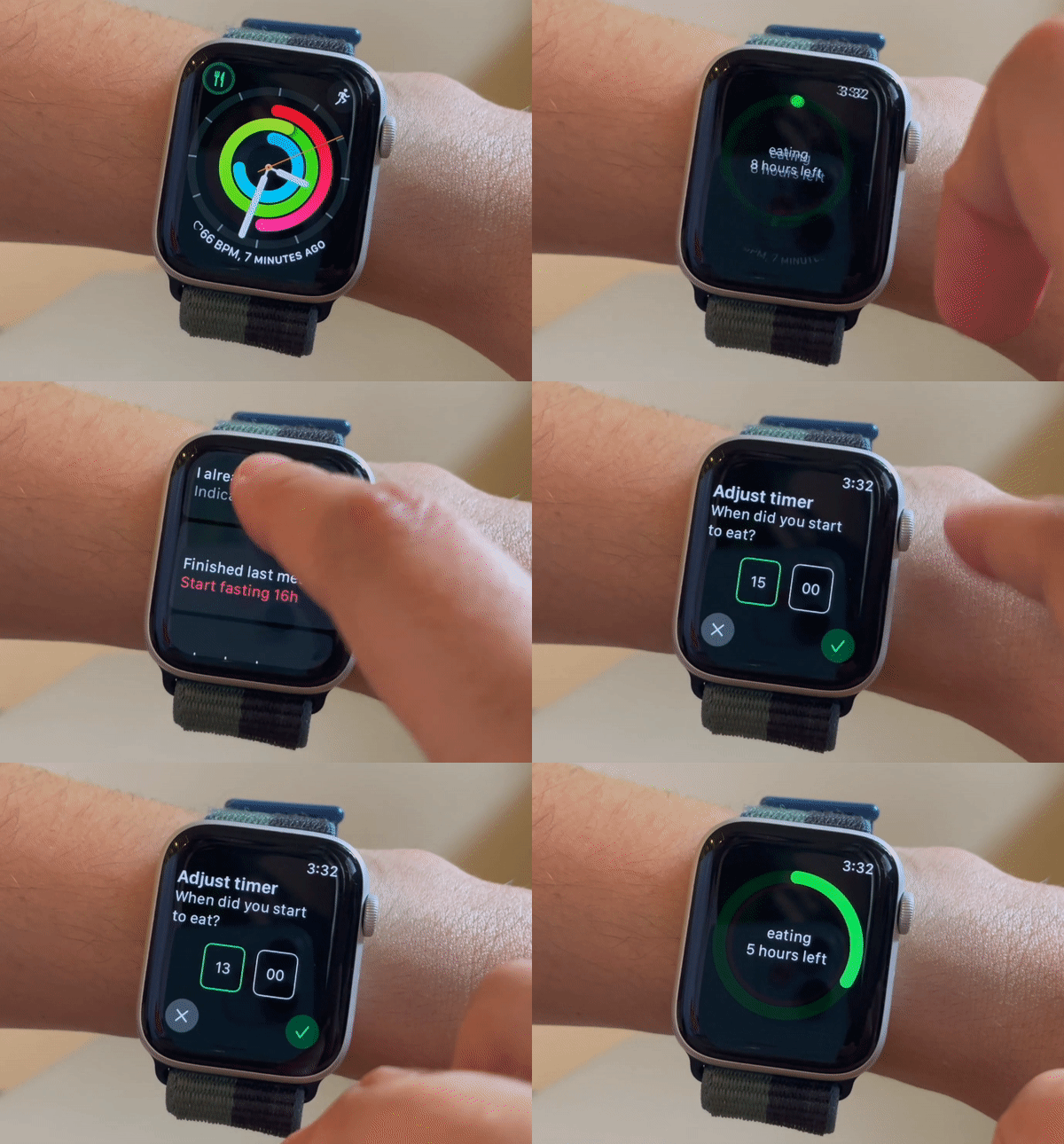
Created and shipped an Apple Watch timer to configure and track your intermittent fasting schedule.
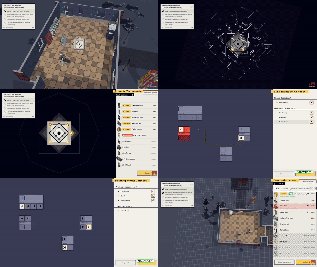
Designing the User Interface of Flat Eye, since July 2020. From initial explorations in prototype to final interaction design, user interface design and some integration with the dev team in Unity.
Also coordinating the extra people involved in adding visual assets in the game: motion designer, icon designer, illustrator
How I used a logotype to make an interactive Progression Tree
Doing a talk for Master II at Gobelins (French School) on working abroad, mentioning topics such as asynchronous work, cultural differences, work/life balance and giving tips to help students with the first steps to move abroad easily.
Deck creation and animation of discussion after the presentation.
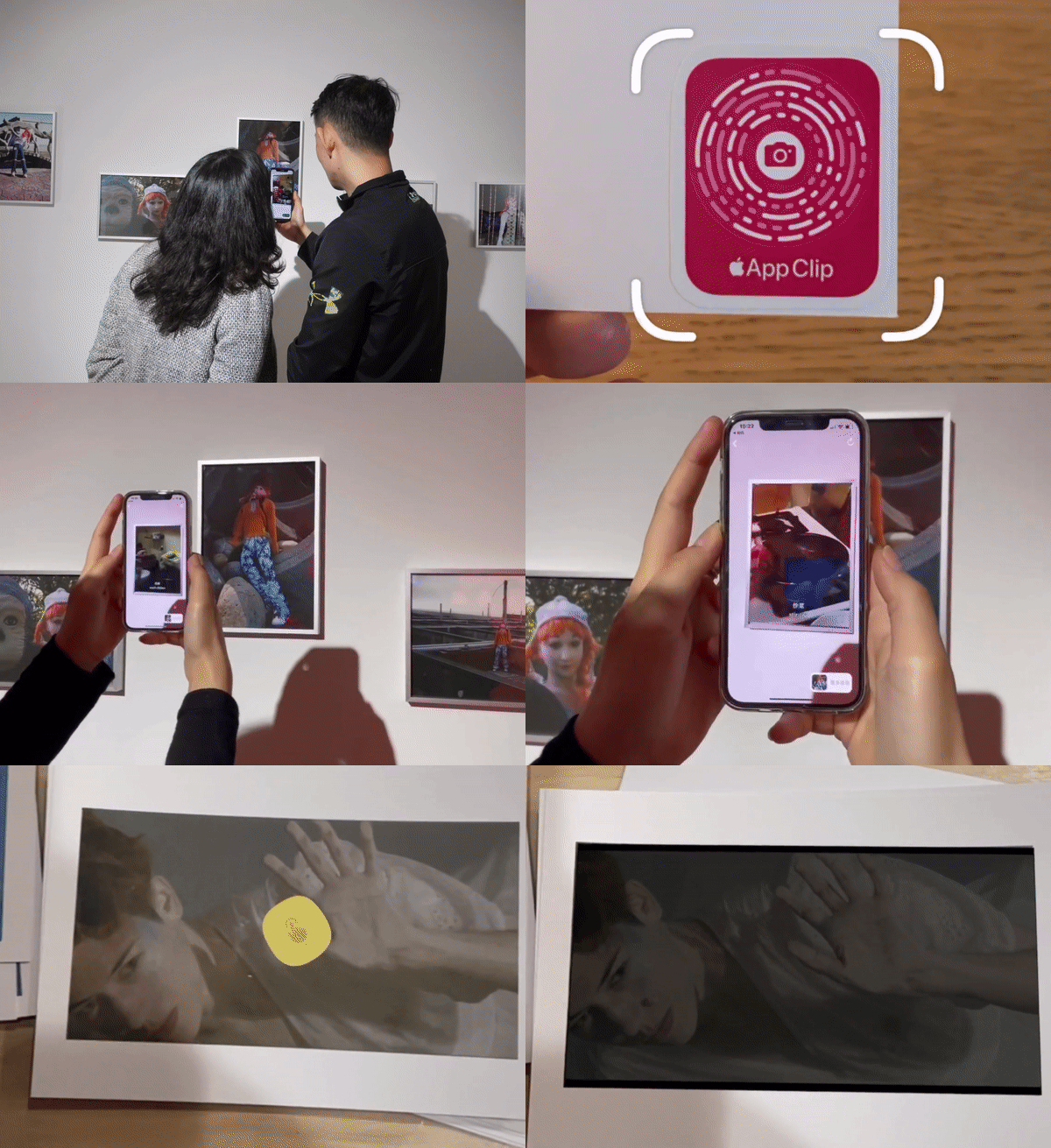
Creating an Augmented Reality viewer for exhibitions, iOS app.
Glazer partnered with artists for 3 exhibitions in Beijing and Taipei.
Using AppClip technology (no need to download the app to enjoy the exhibition), Image recognition in the venue and displaying augmented reality content.
Pitch for BALENCIAGA’s new website, in charge of UX inputs.I focused on seamless personalization, service design, navigation & mobile first conception.We won the project. 🎉
Client : AREA17
Project type: pitch won, e-commerce, strategy
Interaction Designer
Facilitator for nine english speaking design thinking workshops.
Helping the client move forward with their digitalisation and website first evolutions for European markets.
Client : FCINQ
Role: UX Consultant
Introduction to user experience principles called “UX Fields 101” for consultants audience. I covered the basics of what is User Experience, including terms explanation, jobs & workshops. Deck creation and presentation animation.
Complete redesign of the website and events presentation, from general information architecture to booking system.
Pitch won 🎉, leading to production phase.
Client : Upian
Creating an iOS app from scratch. As a 2 people team, this was quite a funny side-project. It took us a year from the first discussion to launching the app live.
Recommendations to enhance the newly launched website. Improving navigation, filters, e-commerce practices, while keeping an Atomic design approach. Work done in design sprints in tandem with an Art Director.
Client : AREA17
The furniture brand wanted to improve user-paths to increase sales, and define the next steps for France website. It was a 10 days mission including an ergonomics audit, benchmark, redesign of funnel, new concept landing pages and a service design reflexion for an omni-channel approach.
They won the project 🎉
Client : Sensio grey
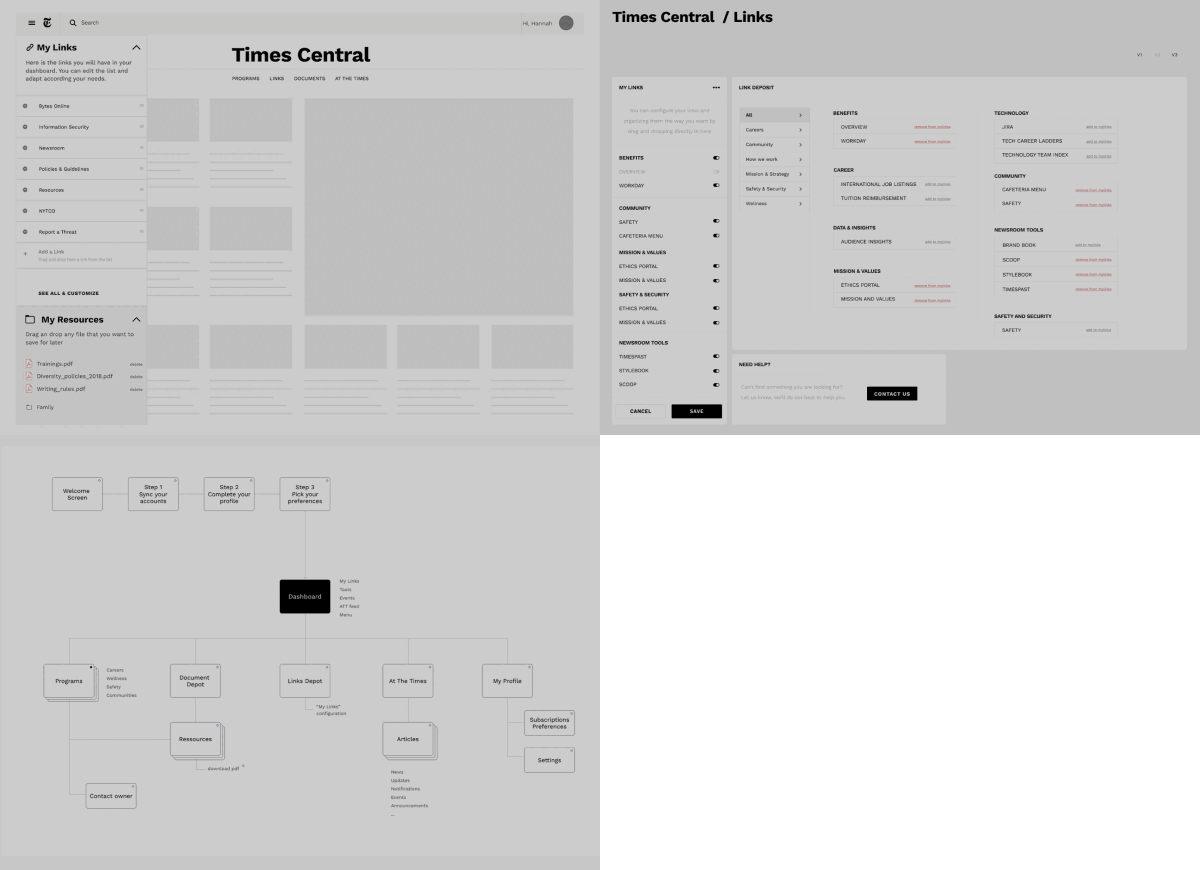
The Times wanted to rethink their intranet to align their new human resources vision.
The key elements to think about were the internal newsfeed and the employees tools section.
Client : AREA 17
Leading the User Experience strategy for l’Oréal Paris new master, to be implemented in +70 countries. During 8 months, my weekly agenda was to present concepts, build decks to convince stakeholders during meetings, help with team coordination and improve the workflow, design for AAA accessibility standards while keep an atomic design approach, in an agile multicultural team.
Client : iCrossing NYC
Formula 1 produced wireframes for their ticketing solution, I did consulting to review those documents and pinpoint quick improvements.
Provided a deck recommendations about what should be kept that way and what could be improved, with few sketches demonstrating how it can be done quickly.
Client : Sensio Grey
Building user-flows for online voting mandatory company elections.
The company wanted to simplify the voting process for employees, allowing them to directly vote online, while keeping in mind legal constraints.
Client : Ada Lovelace
My work was to simplify a service for 6 types of users. From a student looking for a new apartment, to client’s employees who have to take care of paperwork for renting places.
Work included empathy maps, user-journeys, writing qualitative survey, doing phone call interviews, building a recommendation deck for service design opportunities.
Client : FCINQ
Providing user experience consulting services to a team of developers for a language learning application
Early stage strategy and product design to empower people around politics topics.
The start-up raised 2 millions in Round Seed.
Information architecture and wireframes for a Van Cleef & Arpels pitch.
The pitch was won!
Client : AREA 17
Sitemap, information architecture and wireframes to match technical constraints and strategic vision.
Client : AREA 17
This pitch was about mobile first vision, rebranding and better matching with users needs. We worked with strategic insights and personae to match Chinese market and business men.
They won the project 🎉
Client : 5ème gauche
I worked on the interactive gallery of the museum. The goal was to encourage users to browse the Collection through visual filters of their choices, so they can discover Art with familiar elements in terms of lines, light & colors.
Client : AREA 17
Service design for a freelancer’s platform. Skillee at the time, now rename as comet.
Evangelise UX practices, guidance through processes for start-up.
Experience map, personae, user journeys, business opportunities and initial wireframes for a potential app.(They raised 2 millions in Round Seed and 11 millions in series A three years later)
Client : Comet
This start-up product helps people identify the right targets for their trials.
My work was to understanding needs & interdependencies of the product, defining user flows and interactions within the product. Understanding pain points & designing initial wireframes phase for the product on desktop version.
They raised 1.3M few months after the mission.
Facilitator for Design Thinking day with Digital University.
Initial wireframes to create a searching tool around start-ups. Goal was to help people sourcing company and identify potential partnerships opportunities.
Client : BLANK
Redesign Radio Classique website, with a focus on live radio and information architecture to clarify the offer. Service design, wireframes, sitemap and user-flows.
Client : mahi-mahi
For the 2nd edition of this e-sport tournament, we took in consideration the audience expectations and habits around the game, providing a website displaying useful informations, and a betting experience for the main event.
Client : BLANK
Creation of an interactive glass to drive millenials in store.
You could use the interactive glass to take funny pictures, and to place bets. Once the picture has been taken, they can choose to print it in store, or to download it on their phone.
Client : BLANK
Usability evaluation of the website, by devices, and recommendations to improve it.
Client : BLANK
A french start-up wanted to shift their product to target french & us market. We worked in Brooklyn for 10 days of workshops, to help them define more clearly what they wanted.
Client : BLANK
Le Bon Coin was launching a new service to monetize advertising on their website. Our mission was to present it and make it understandable very easily.
Design an Insurance Diagnosis Tool to help users who had a glass breakage accident find insurance coverage information.
Client : Isobar
Using France télévisions footages from Archives National Institute (INA), we created a personalised timeline for users login with Facebook Connect. Each user had their specific Timeline according their birthdate and personal interests, to remember what was television at that time.
Client : 5ème gauche
Answer pitch for the new website. I focused on a personalised search sort products to find what you need. Digital strategy, including user journeys leading to wireframes.
Client : Stinkdigital Paris
“Le Bon Geste” (meaning “The Good Gesture”) was a facebook game inside “Recyclons nos papiers”‘s web documentary. Designed for mobile & desktop, it helped players learn and remember how to recycle different types of paper depending on situations. Game design mechanics, team coordination and part of Art Direction team.
Client : FCINQ
Clients I’ve worked with
- Balenciaga
- The New York Times
- Dior
- L’Oréal Paris
- Sonia Rykiel
- Van Clef & Arpels
- Raffles
- Barnes Foundation
- Arte
- Redbull
- Gobelins
- La Philharmonie de Paris
- France Télévisions
- Radio France
- Radio Classique
- Warner Bros
- Formula 1
- Air Liquide
- Le Bon Coin
- Carglass
- Campusea
- Haribo
- Nespresso
- IKEA
- Redbull Kumite
- Le Tour de France
- PMU
- Zappos Kids
- Comet
- Inato
- Make.org
- Pops
- Crédit Agricole CIB
- BPI Hub Digital
- AREA17
- Stink Digital
- FCINQ
- iCrossing
- Isobar
- Monkey Moon
- RawFury
- Sensiogrey
- Tasmane
Recognition
- 2023 Pegases, Au delà du jeu vidéo, Flat Eye
- 2020 Awwwards, Honorable Mention for Zappos Kids
- 2019 Awwwards, Honorable Mention for the New York Times
- 2017 Awwwards, Honorable Mention for Barnes Foundation
- 2017 Awwwards, Website of the day for Sonia Rykiel
- 2015 FWA of the Day, Recyclons nos papiers
- 2015 Awwwards, Honorable Mention, Recyclons nos papiers
- 2015 Awwwards, Honorable Mention, Paris la nuit
- 2015 Awwwards, Honorable Mention, Récits d’Egypte
- 2015 Awwwards, Honorable Mention, IRAQ
- 2015 Awwwards, Honorable Mention, Karl Lagerfeld
- 2015 Awwwards, Honorable Mention, Labo M
- 2015 Awwwards, Website of the day, Tandems