L’Oréal Paris
Role: Lead UX
Client: L’Oréal Paris
Agency: iCrossing NYC
Duration: 8 months
Goals
- Mobile first
- Editorial & e-commerce
- AAA accessibility standards
- Different design constraints for every country
- Personalised experience
I was contacted by iCrossing to join the Team as the Lead UX, to create a mobile first new master to be implemented in +70 countries.
We worked together from discovery phase to MVP implementation in Agile methodology during 8 months.
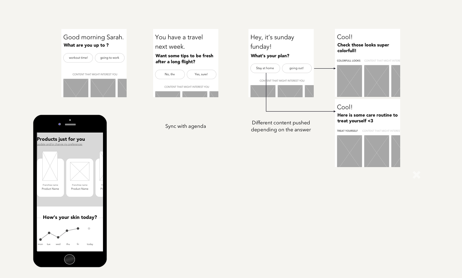
7 questions to guide users
Often, users are looking at your website to have some answers, no matter which page they’re on. Modular approach’s foundation, allowing us to create type of content, and re-organise it differently according each page’s needs.
Because some countries were selling online, others just focusing on editorial content, we had to think of something to take local discrepancies in consideration.
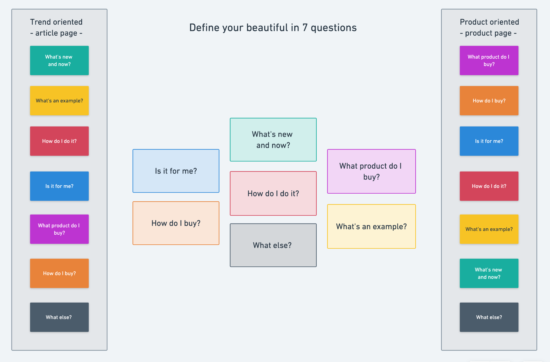
Because of the large number of countries to design for, we had to think of something very flexible to match every market’s need.
Atomic Design was a good answer for us.
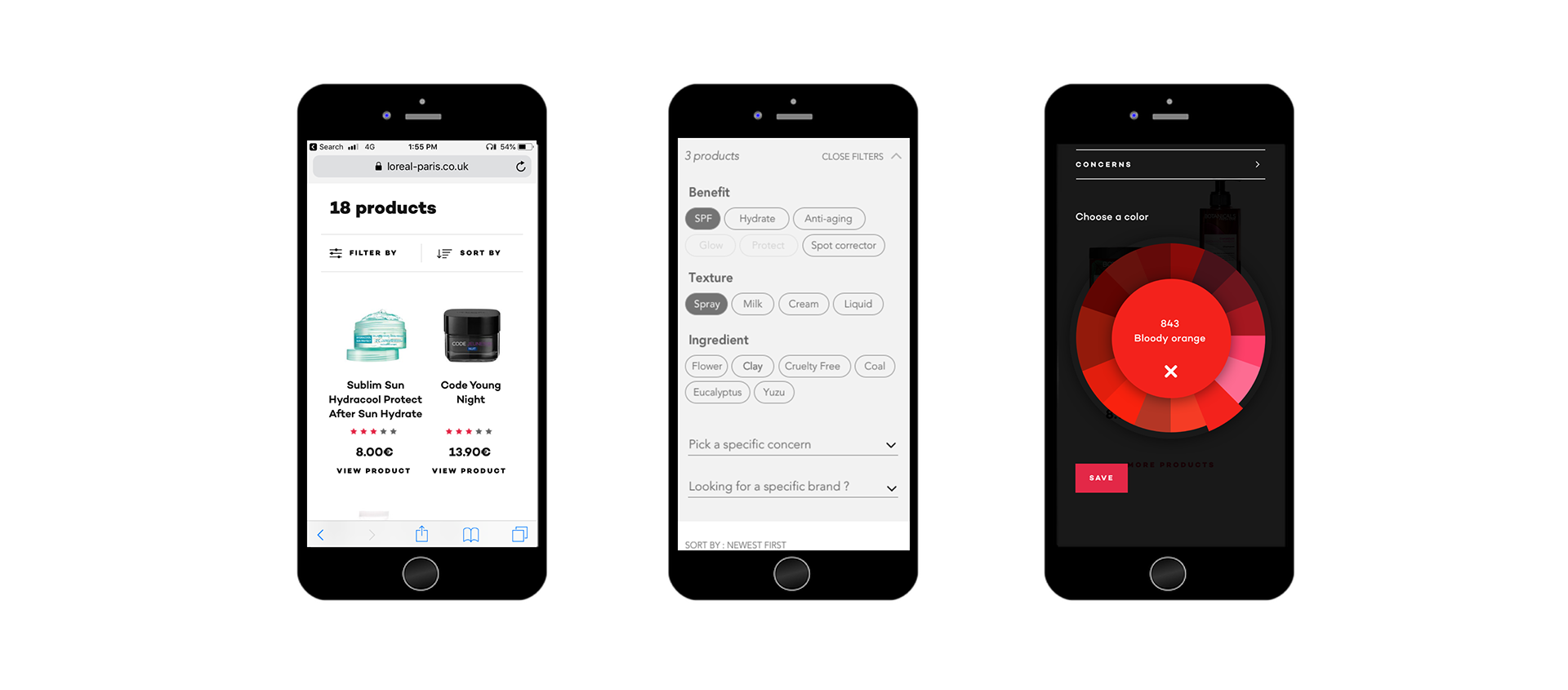
Contextual filters
I put a lot of efforts into the filters, especially understanding the typologies of categories.
The audit of the current websites of l’Oréal-Paris revealed they were unpredictable.
Every category changed from one country to another, and some filters had different meaning but same label (Dry skin as a concern, and as your skin type for example).
I built a new system, based on user searches in google :
- looks
- benefits
- texture and/or color
- ingredients (for allergy or politics engagement)


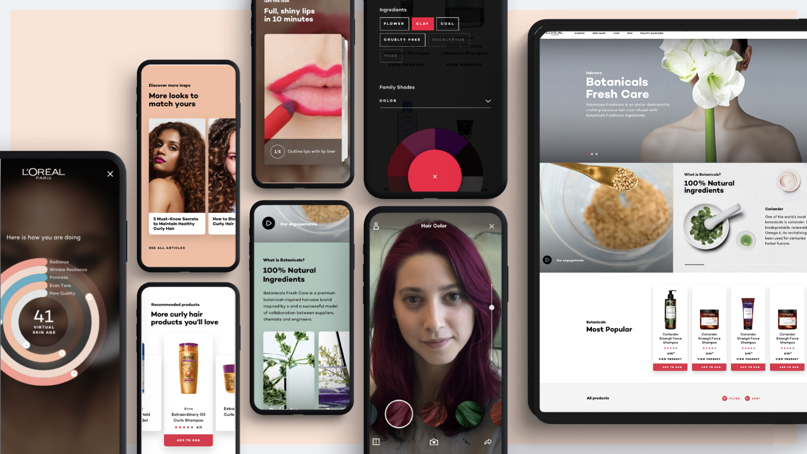
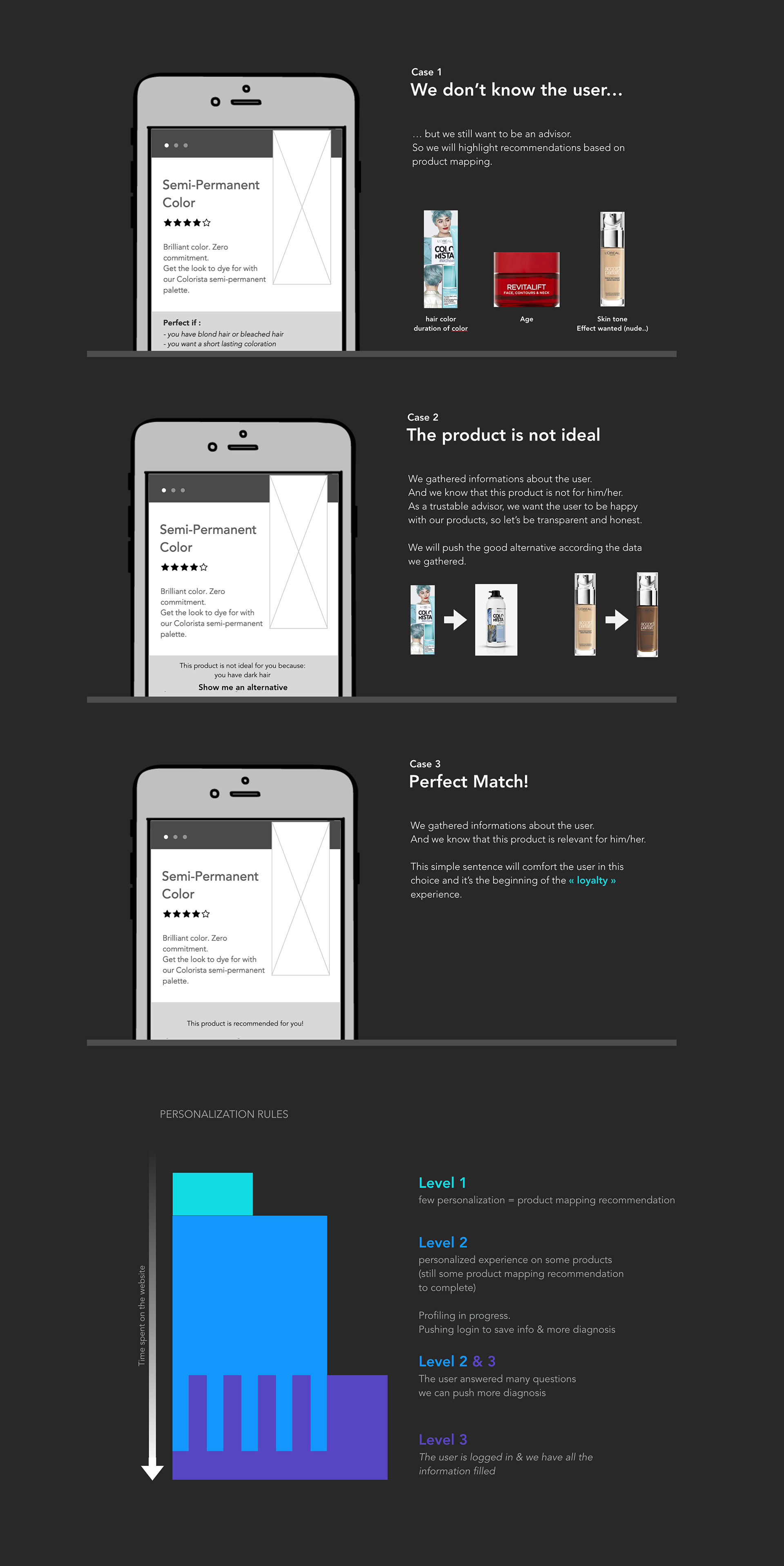
Diagnosis Tool – is this product for you?
This option is a little trick that highlight products in a category page to help users.
When there is 40 type of shampoo, how can you choose? I personally freak out.
Filters sometimes don’t make sense when you don’t have the brand knowledge.
This is for those who doesn’t know their skin type, their skin color, and basically who have very little knowledge about beauty. The idea here was also to provide a quick recommendation even if we don’t know the user. You could find on a product page “This product is perfect if: you have bleached hair” for a pink hair color for example.


User-test driven
We had to build a master that will go live in 2 or 3 years in some countries, we wanted to think forward and try bold stuff. But we couldn’t afford to do something that users don’t understand.
So we worked with the platform Ferpection, to test our design ideas with a representative panel.
- organise usability test sessions
- thinking the flow
- writing questions test
- present a result digest to stakeholders of L’Oréal
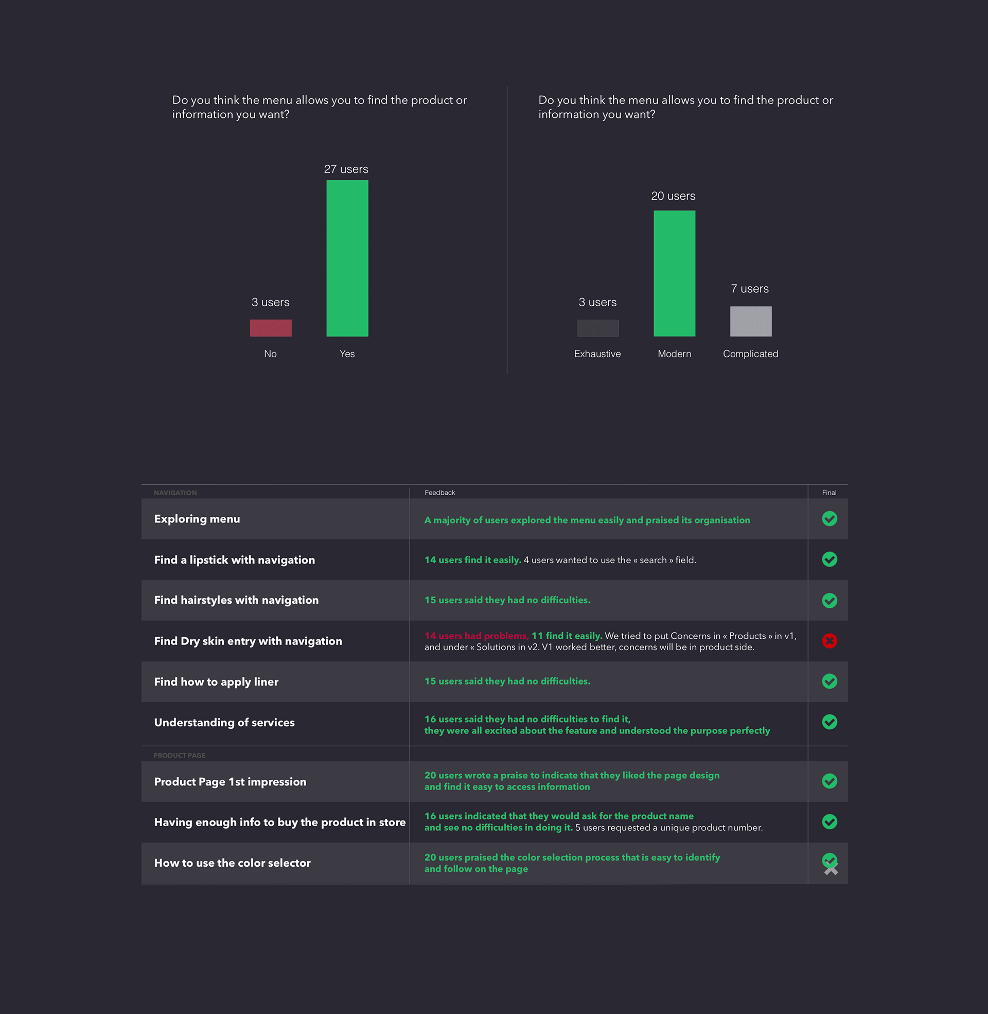
Early user-testing gave us confidence in our decisions, leading to a higher conversion rate, thanks to digital try-on and a mobile first experience.