The New York Times’ Intranet
Role: UX Designer
Client: The New York Times
Agency: AREA17 New-York
Duration: 150 hours
Goals :
- Empower employees through the intranet
- Onboarding easily new hires
- Change their current stream of communication
- Define the Product Vision
To align their new human resources vision, The Times wanted to rethink their intranet. Our mission was to identify useful features around internal tools, while making it useful for employees.
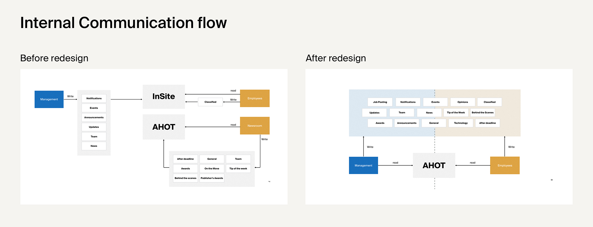
Reflecting the new organization
It took us some time to figure out how the intranet was organised today, and how it reflected the current organisation. Historically, the Newsroom was separated from the other teams. The Times wanted to change the communication flow, to increase communication between all teams.
How to transform their current space radically and still make it feels natural for employees?
A place for Empowerment
One of the sub-challenges was to “empower employees” with this new intranet.
I put a lot of energy into that question.
How can an intranet, from a company, really empower employees?
Here are some of my suggestions:
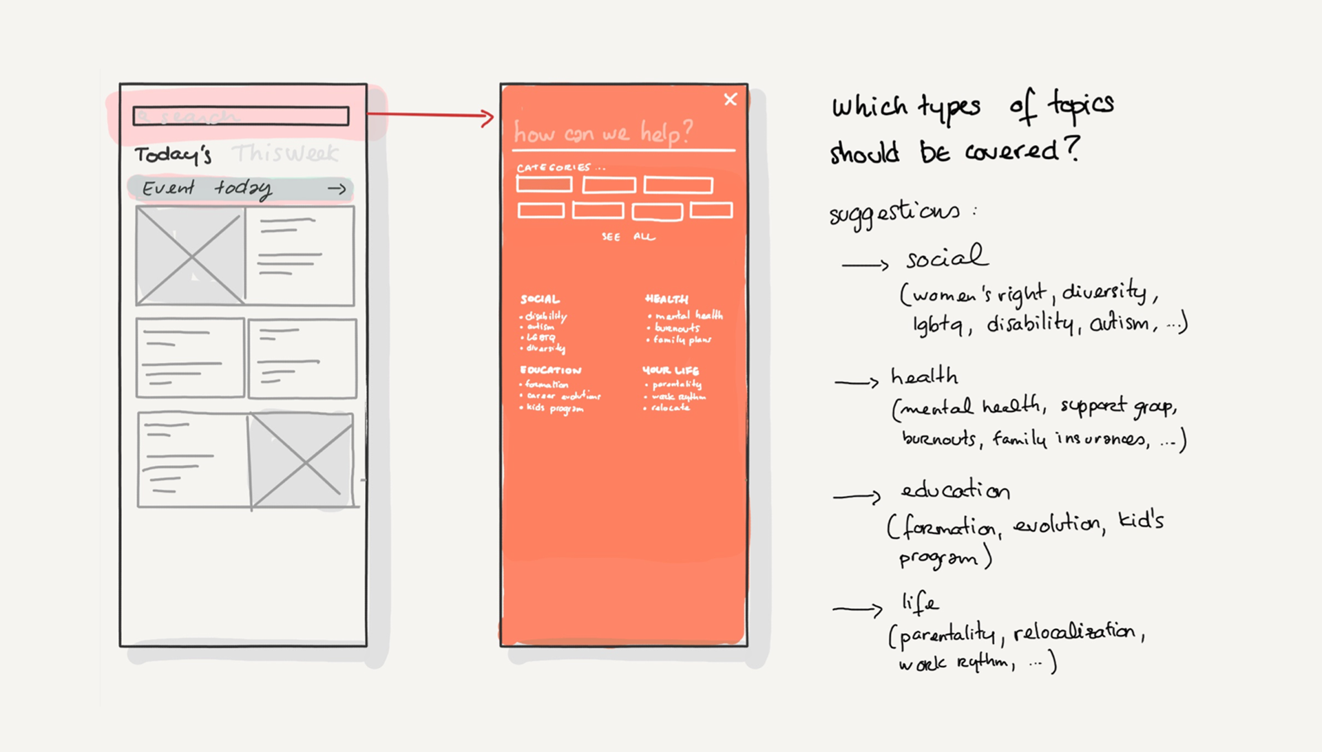
- A Search tool, starting with its label itself : “How can we help ?”
- Categories highlighting the key issues for people, like health insurance questions, or “feeling stuck in your career?” questions.
- Days off you can benefit highlighted clearly
- Company’s position on diversity and inclusive writing as journalists
Each categories would lead to Evergreen content to help employees with those daily struggles, or questions.
Display those categories as a company means “those questions are okay, and yes, we can talk about it.”
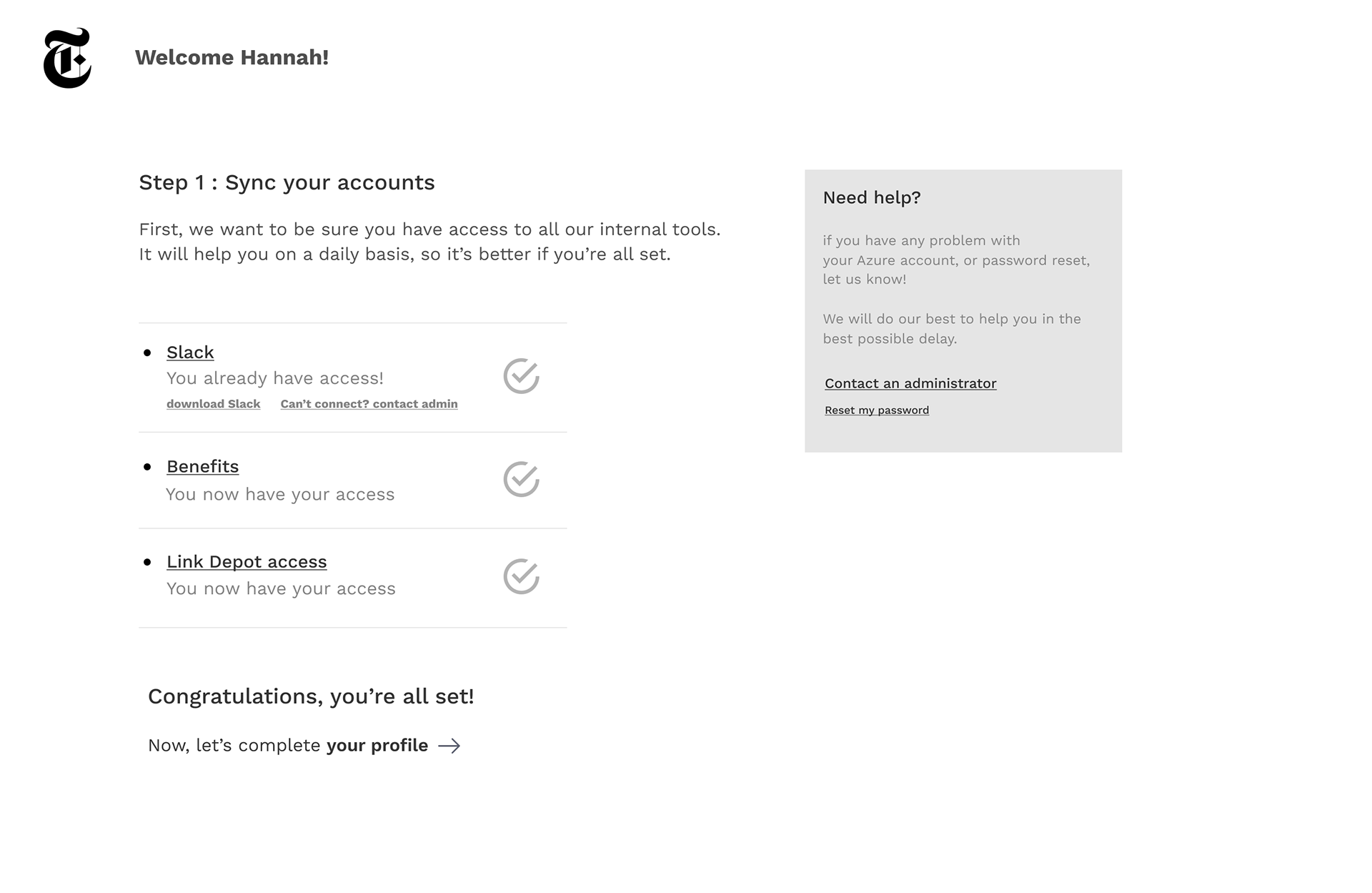
Easy Onboarding for new hires
When entering a new workspace, everyone remember the moment you have to take care of getting your internal tools ready:
- Email address
- internal authorisations,
- joining the Slack spaces,
- …all this stuff that leaves you out of the real company life if you don’t take care of it.
With bigger companies comes longer process for this.
For this new intranet, we came up with the “checklist” page, to keep track of your set-up.
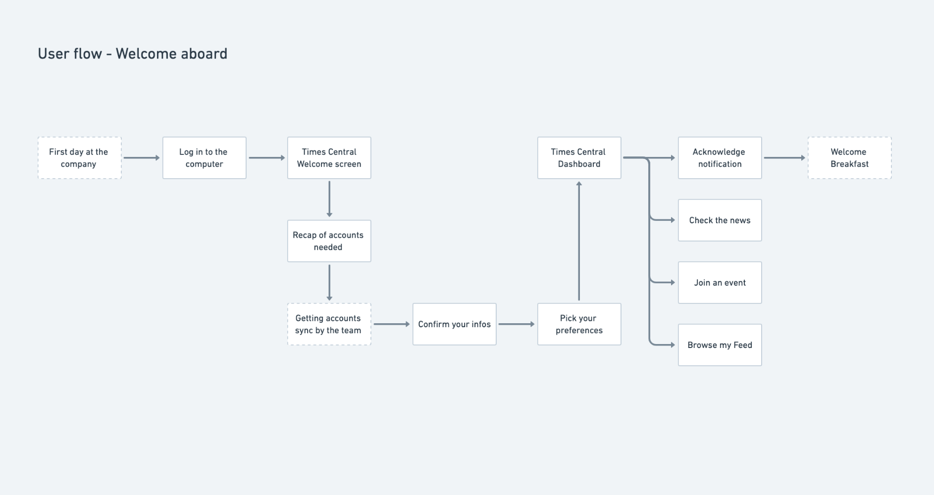
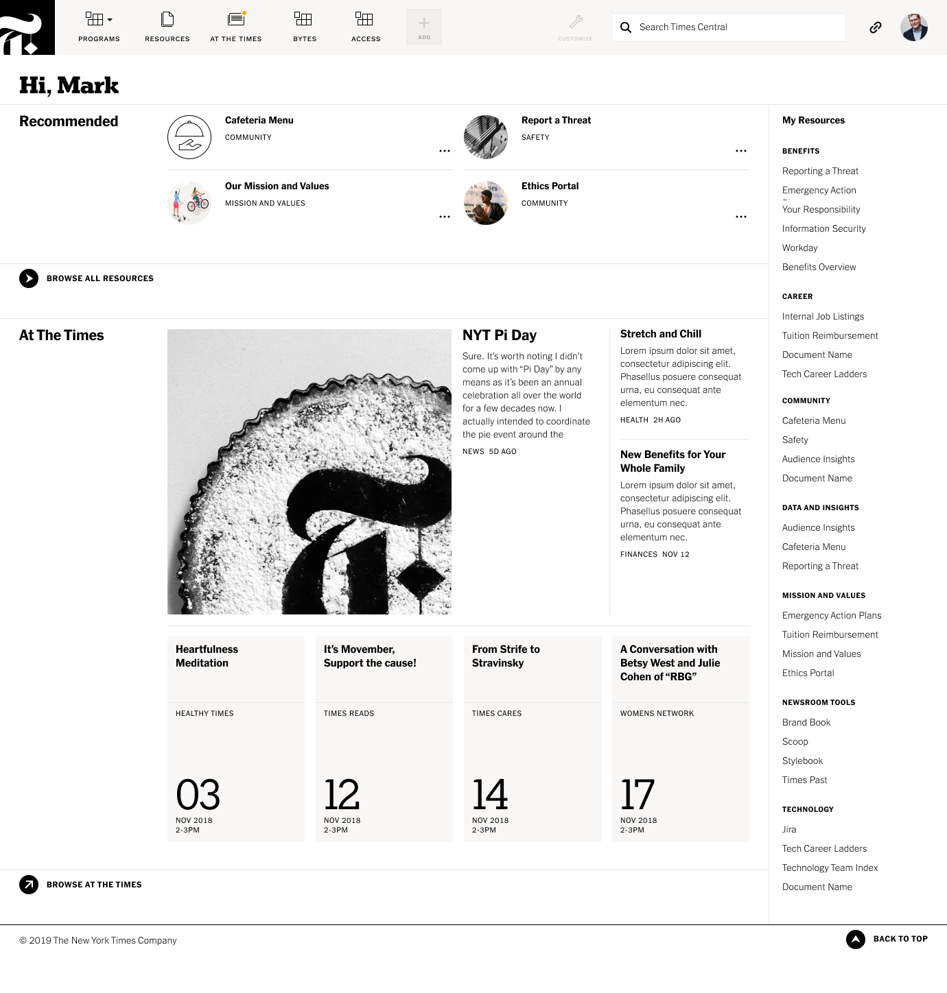
A customizable Dashboard
The company built several tools for the employees, but not all of those tools are useful to everyone.
That’s why we created a quick access system, tools that you can see all the time on your dashboard.
Employees can select useful ressources links or specific tools they use often.
Because we wanted something simple enough to be done in a few seconds, after a few rounds of iterations, we decided to go with the “switch” element for each link.


Intranet redesign is something I like a lot, for once it’s not about selling something, but rather to try to build something useful for people.