La Philharmonie de Paris
Key Points
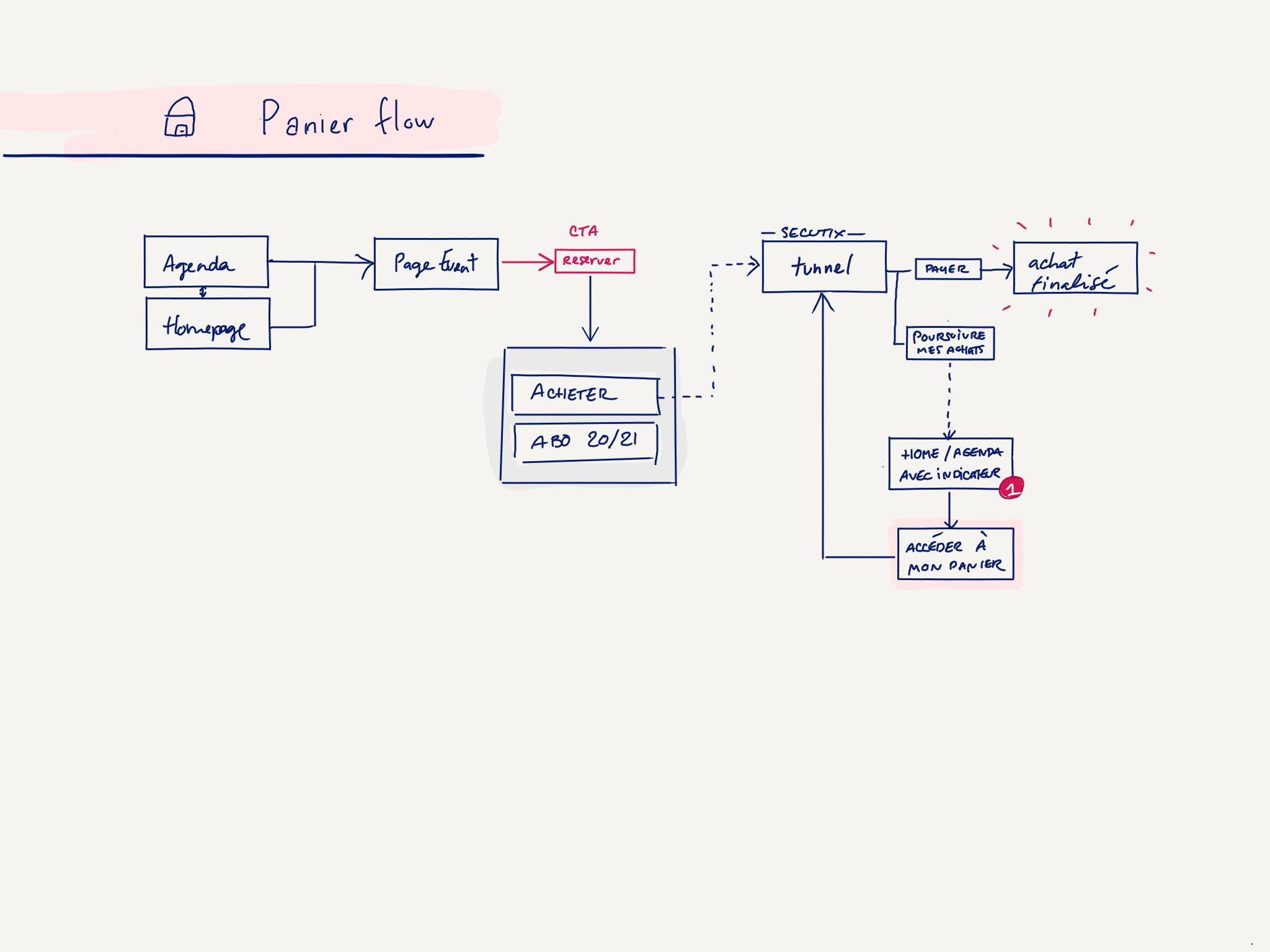
- Comprehensive website re-architecture
- Improve navigation paths
- Simplify their annual vs one-time booking system
- Reduce the number of templates for an easier maintenance
- Unified Call-to-Action to buy tickets
I was contacted by Upian for this pitch. We won the project 🎉
La Philharmonie de Paris is a public institution well known for music events.
They also have exhibitions, conferences and fun workshops for all ages, but few people knew that. We re-worked the navigation leading people to understand better the full range of services.
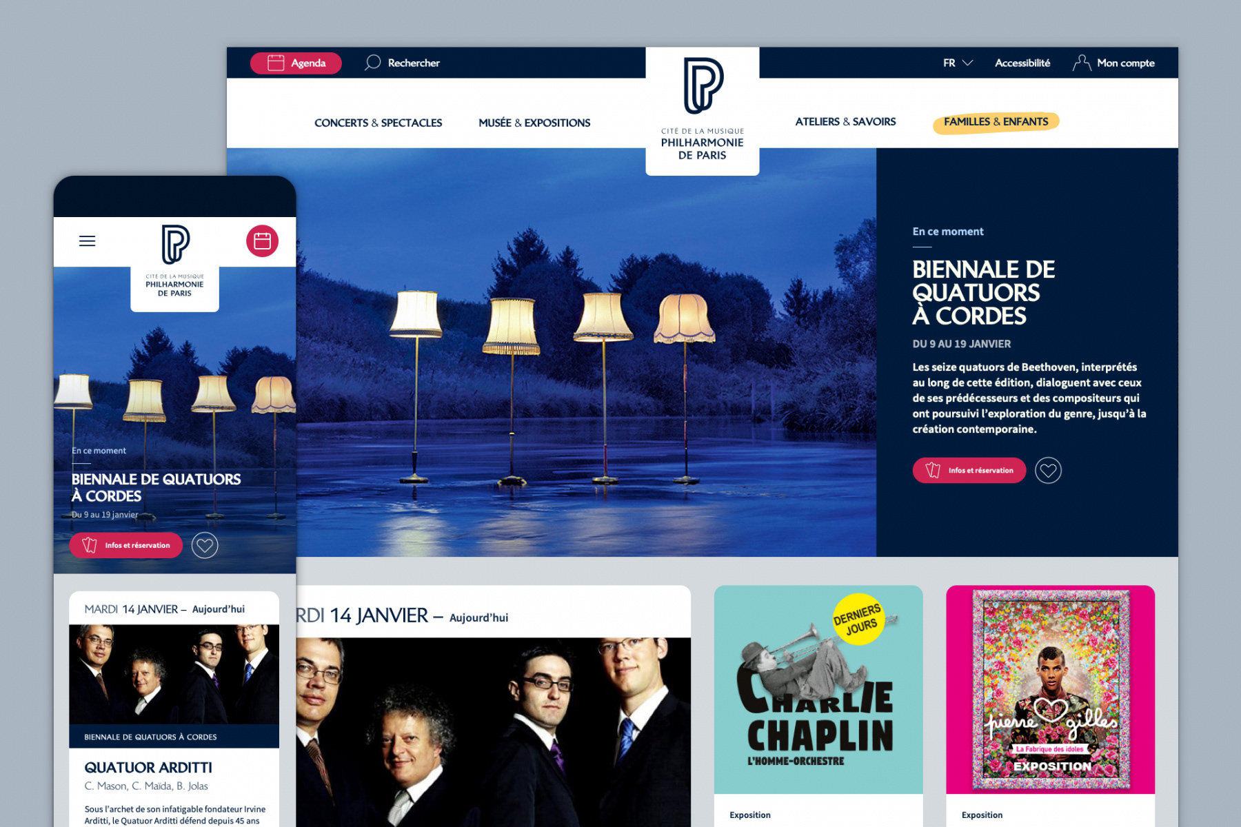
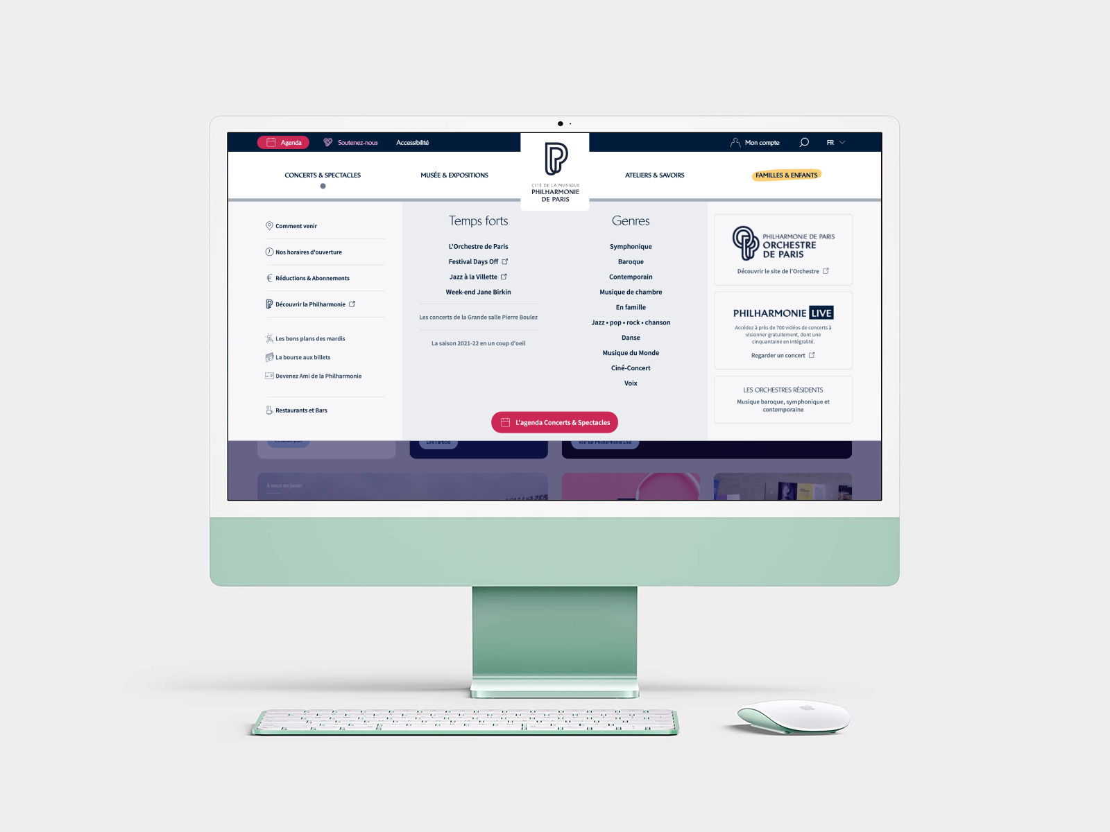
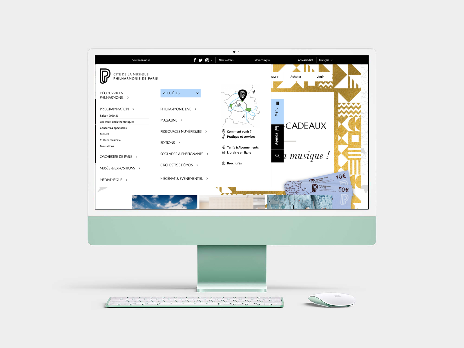
Navigation – After & before
The challenge was to make the offer very clear.
Because they had so many content & event types, the previous navigation displayed 12 main entries in navigation, with a focus on “Program”. Scanning this navigation was complicated.
So we did a lot in Information Architecture, regrouping content into 4 main entries :
- Concerts & Show
- Museum & Exhibitions
- Workshops & Culture
- Kids content
In order to reduce the number of templates & the website’s depth, we had to :
- define a strategy in terms of priority
- suppress old/irrelevant content
- merge some contents in the same page (if relevant)
- separate content that was previously in the same page, but not related
The way content was structured before was the reflect of their internal organisation, which is often the case.
We worked together to create information architecture foundations around user’s expectations first.
Agenda, first explorations
Wide range of offer means a lot of events possibilities, which means, lots of filters.
Here is one of my first prototypes regarding Agenda Filters.
Highlighting events categories first, leading by date, and other options available but as a secondary level.
What was really important in the end was the context of events research.
I came up with a few user-journeys in mind :
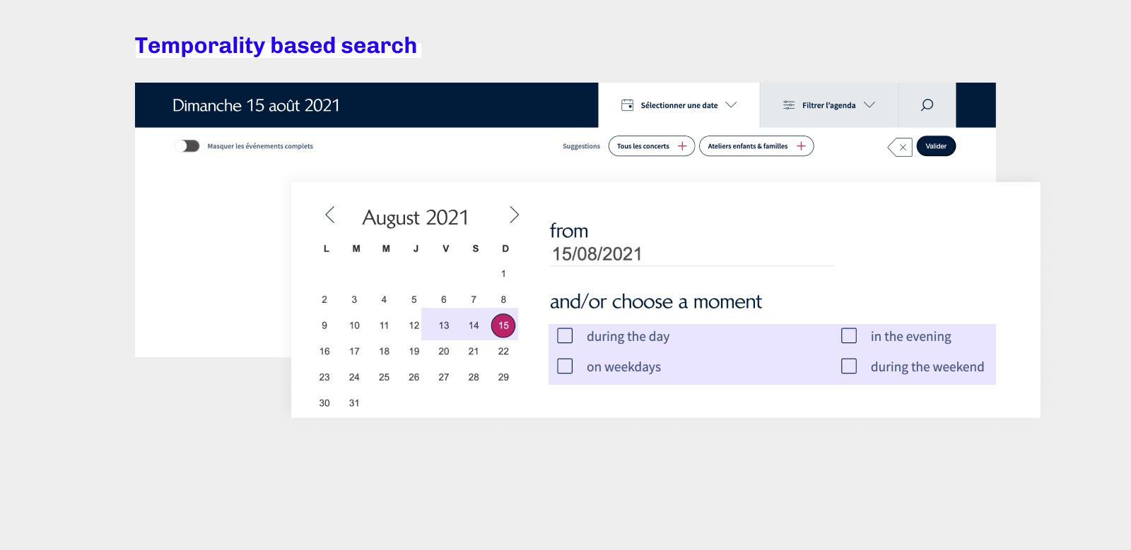
- Temporality based search : “I am free tonight, or this week-end”
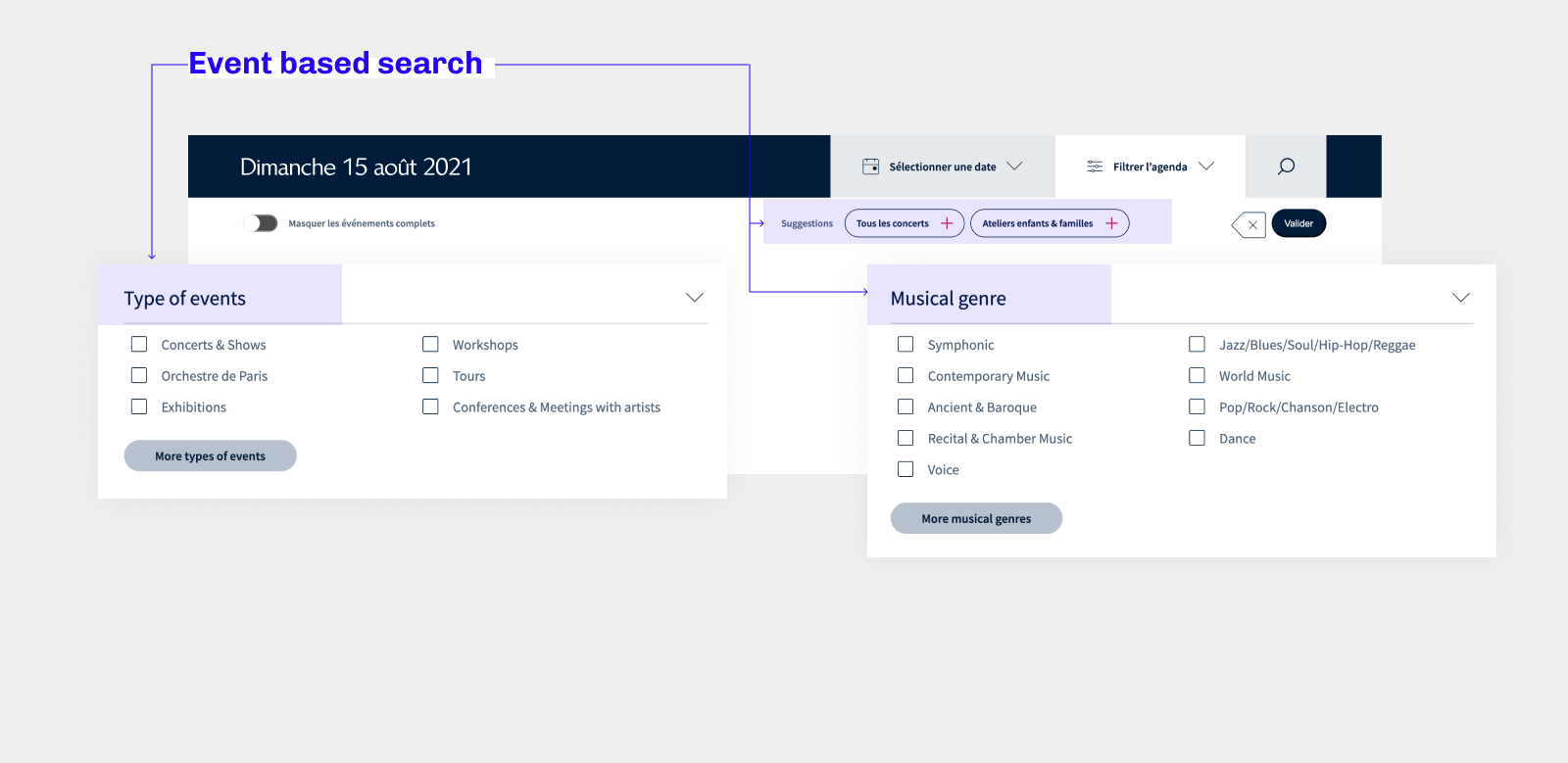
- Event based search : “I am interested in Kids activity, all year”
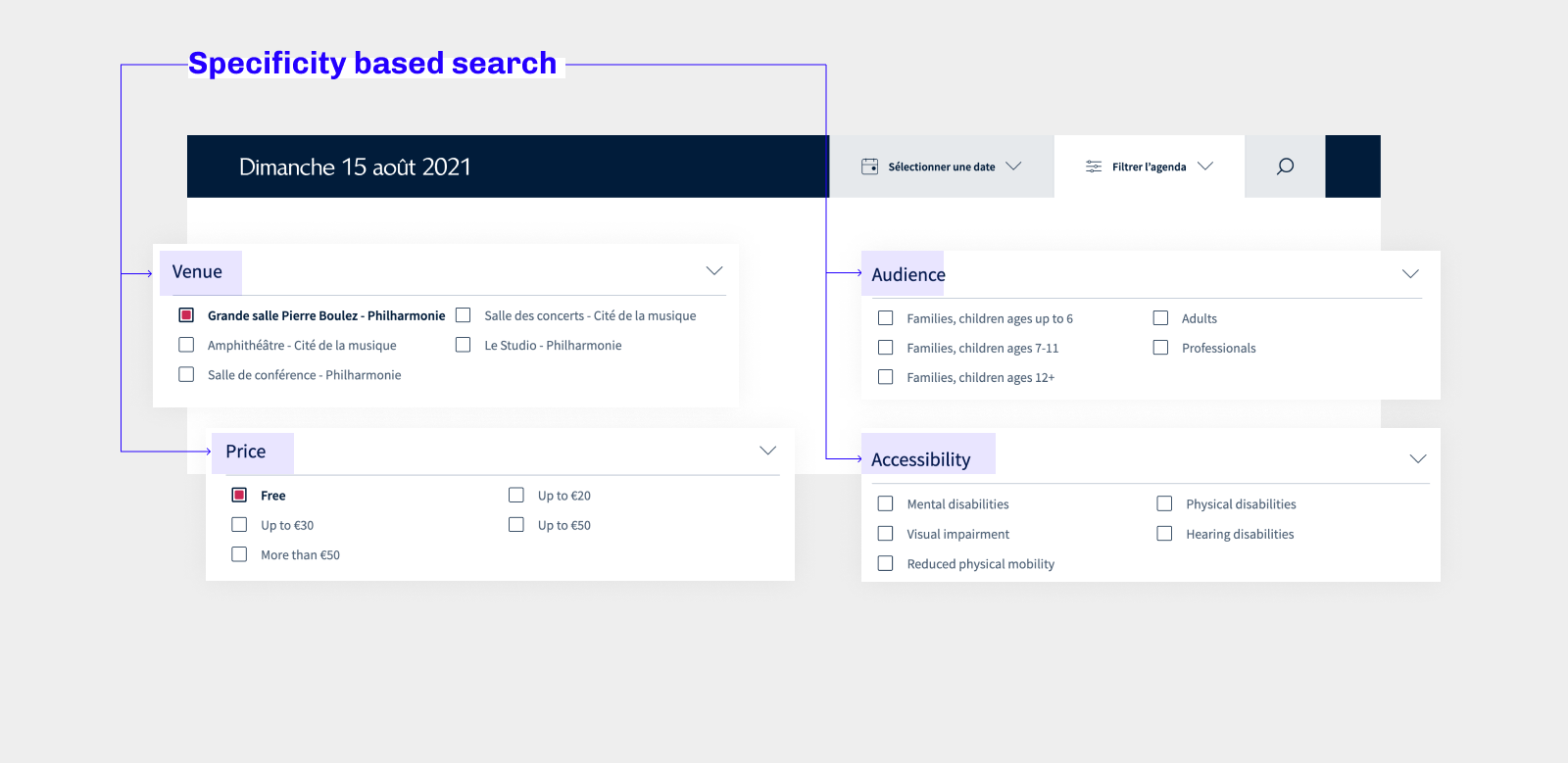
- Specificity based search : “I have a specific criteria in mind, Venue, Accessibility, Pricing…”
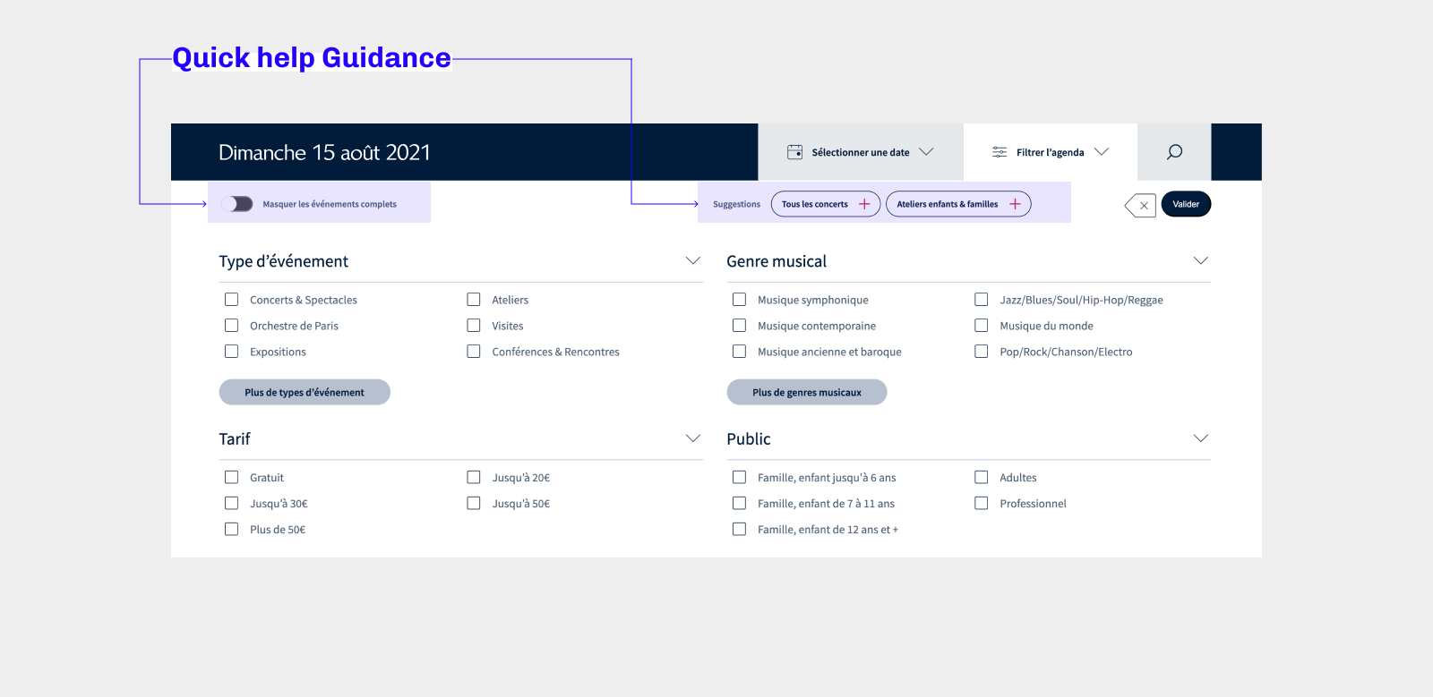
- Quick help Guidance : highlighting popular suggestions, and removing sold-out events from the list,
The specificity based search is particularly interesting for this website :
most of the people wanted to see a concert in the famous Venue (Grande Salle Pierre Boulez), so for them, the event was not the primary criteria.
Some people were looking for music events from l’Orchestre de Paris. It was also a specific filter.
The Public Institution provided Accessibility criteria (such as physical disabilities, visual impairment, hearing disability, reduce physical mobility…) because some venues are more suited to those, as well as Pricing criterias, including free events, so people with less ressources can still have access to cultural events.
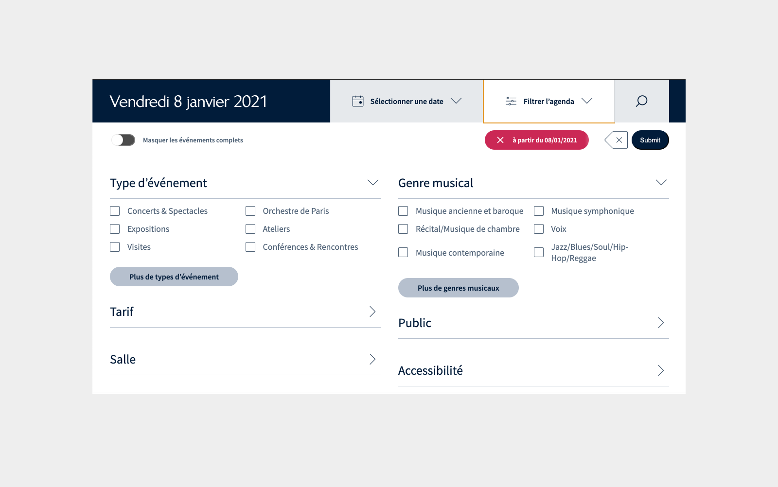
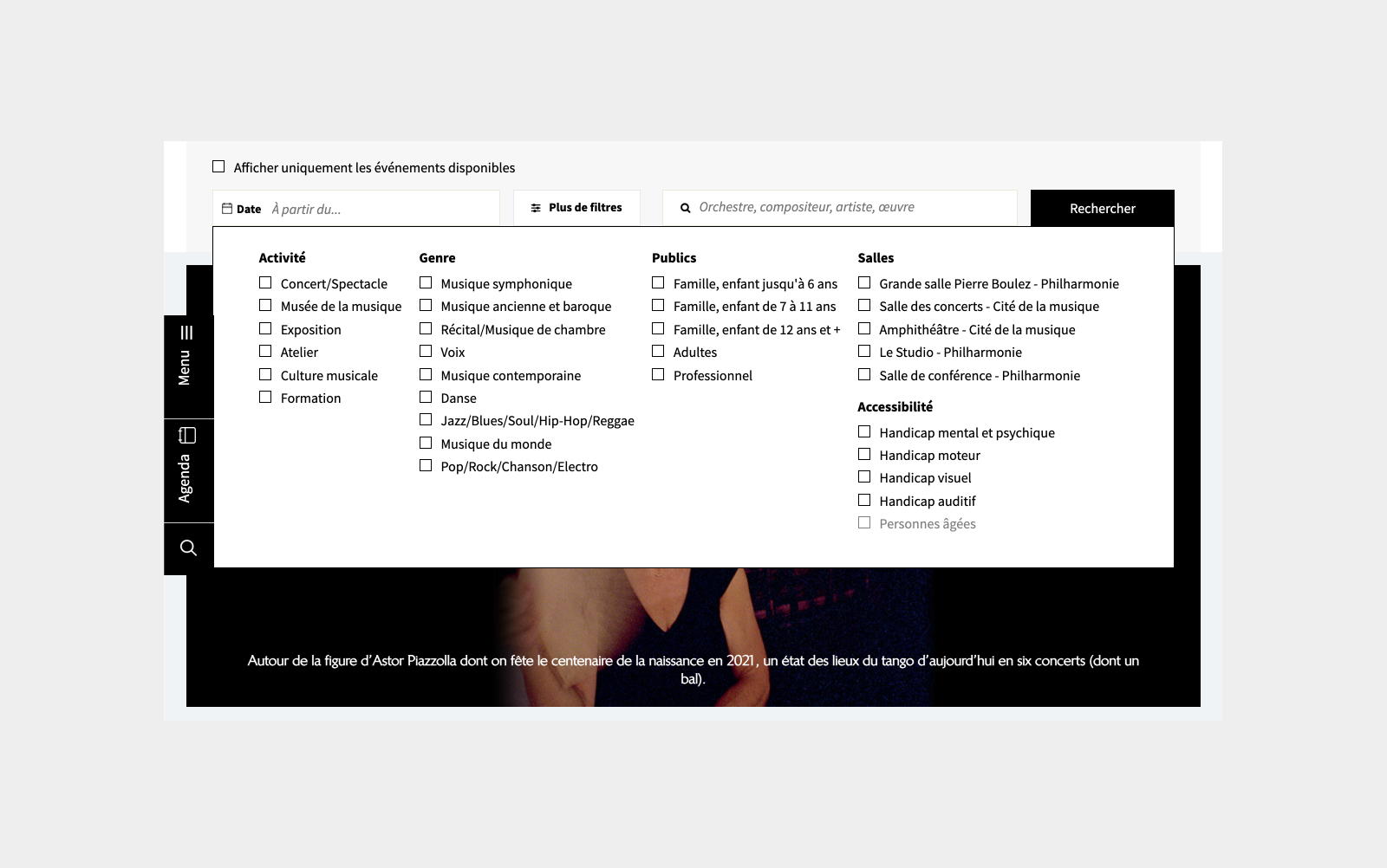
Filters in the Agenda – After & Before
When looking for events in the agenda, users felt overwhelm. Too many choices displayed in the same time.
We reorganised the filters types, displaying in first the most selected ones. Users can still view more if needed.
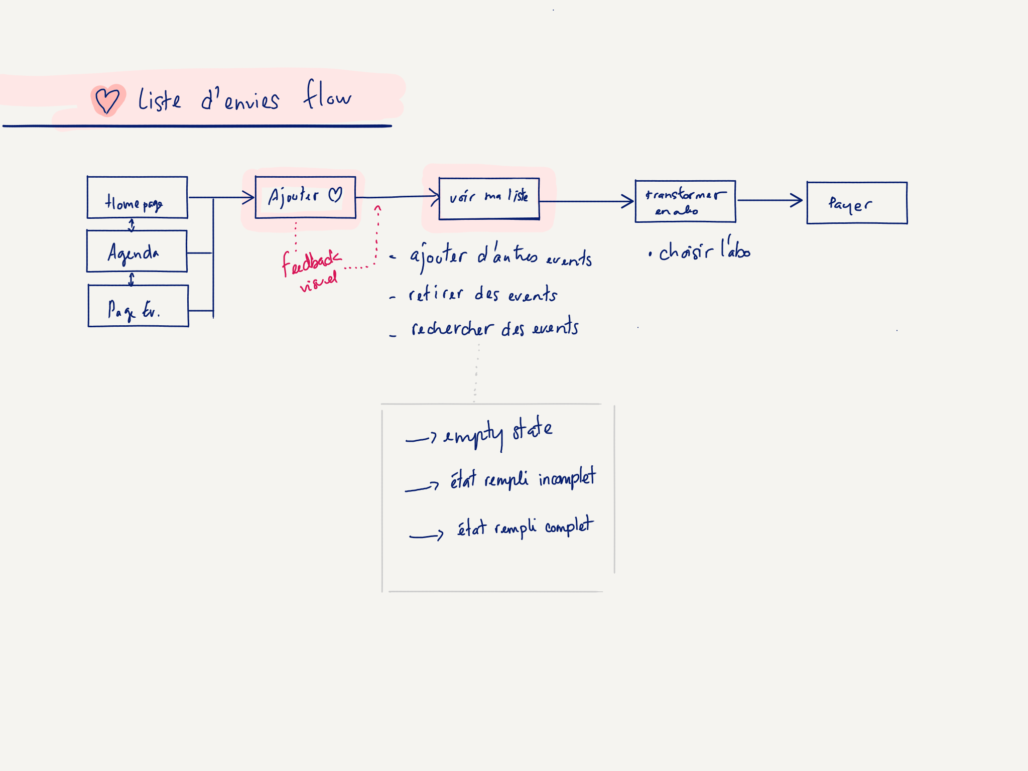
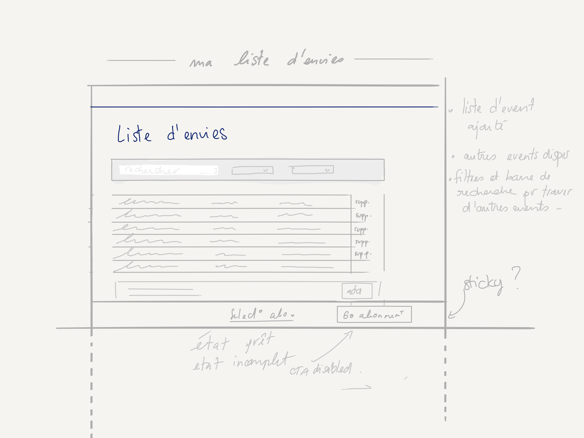
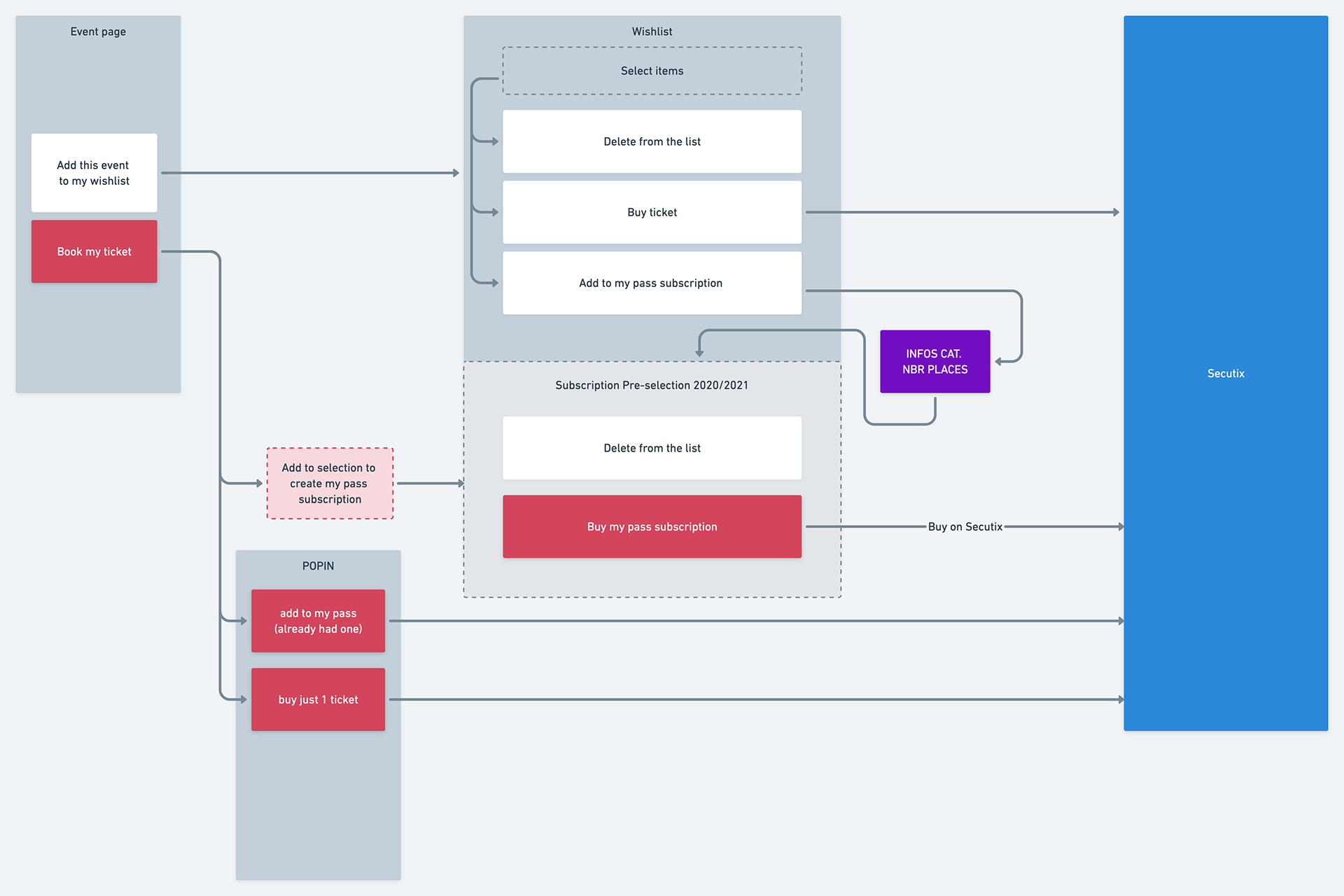
From Wishlist to Subscription
The Subscription system was not really understood by new clients.
One of the ideas was to implement a wish-list that you could transform into a subscription. Resulting in financial advantages for customers.
This feature was designed and approved, but has not been implemented yet.
Design Process
This project was done with Upian. We worked together in close collaboration during 6 months, fully remotely with a 7 hours time delay. And we had a very smooth workflow.
In order for them to focus on Visual Identity, UI & strategy, my scope of intervention was clearly defined.
I provided :
- prototypes
- information architecture deliverables
- sitemap & content page structure
- templates’ wireframes
This project was one of a kind. We genuinely suggested everything we thought would be cool to do, even thought we knew it would be hard to implement. And yet, they did it.
