Barnes Collection
Goals :
- Explore at least 3 radically different concepts for the Collection experience
- Design in tandem (UX & VD) the most convincing one
- Ensure user experience concepts follow accessibility guidelines
- Experience suited for both Mobile & Desktop equally
I worked with AREA17 for this project. It was a 10 days mission.
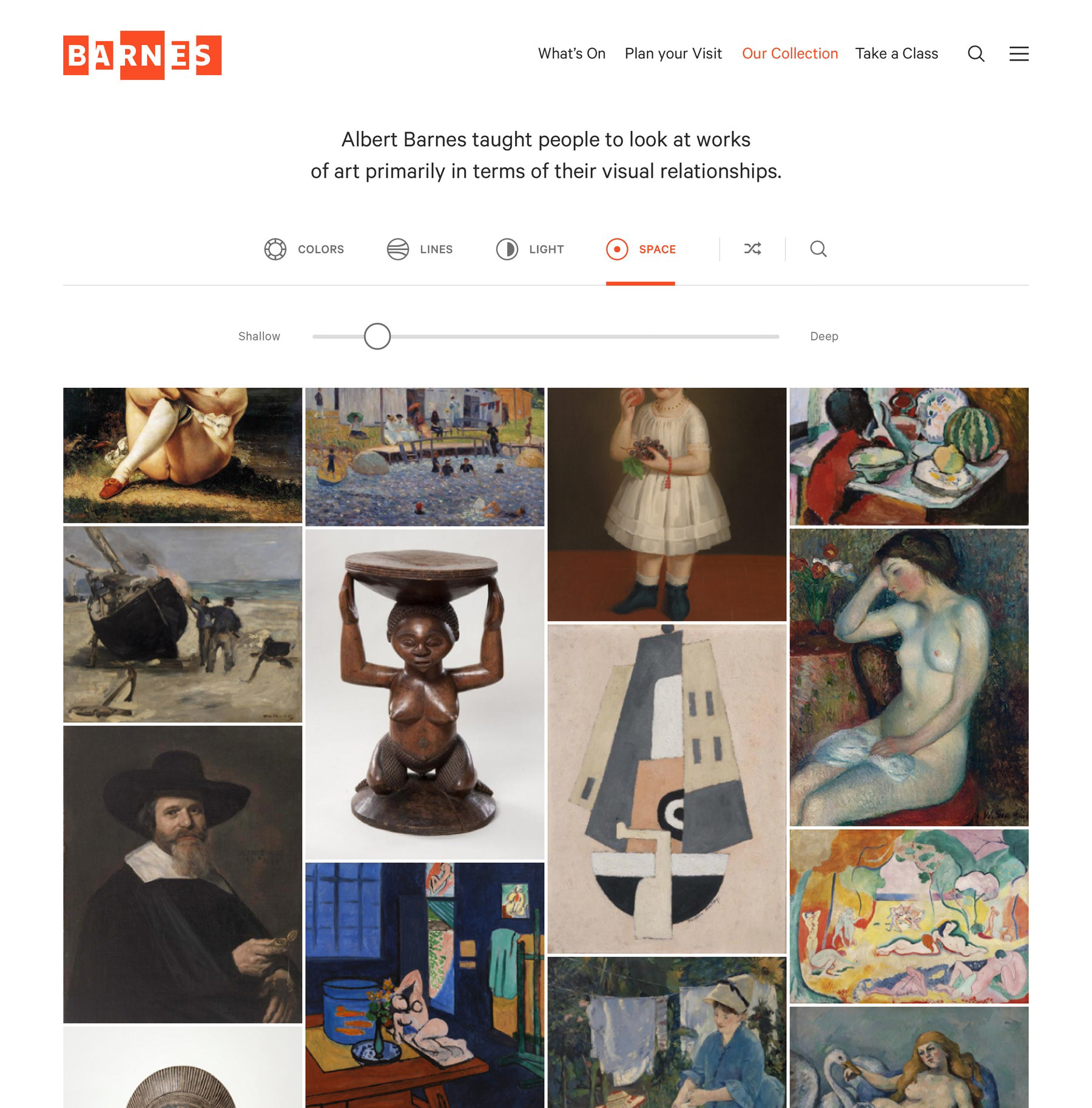
“Albert Barnes taught people to look at work of art primarily in terms of their visual relationships”. The Foundation wanted a browsing tool that follows this principle.
Finding the concept, generating ideas
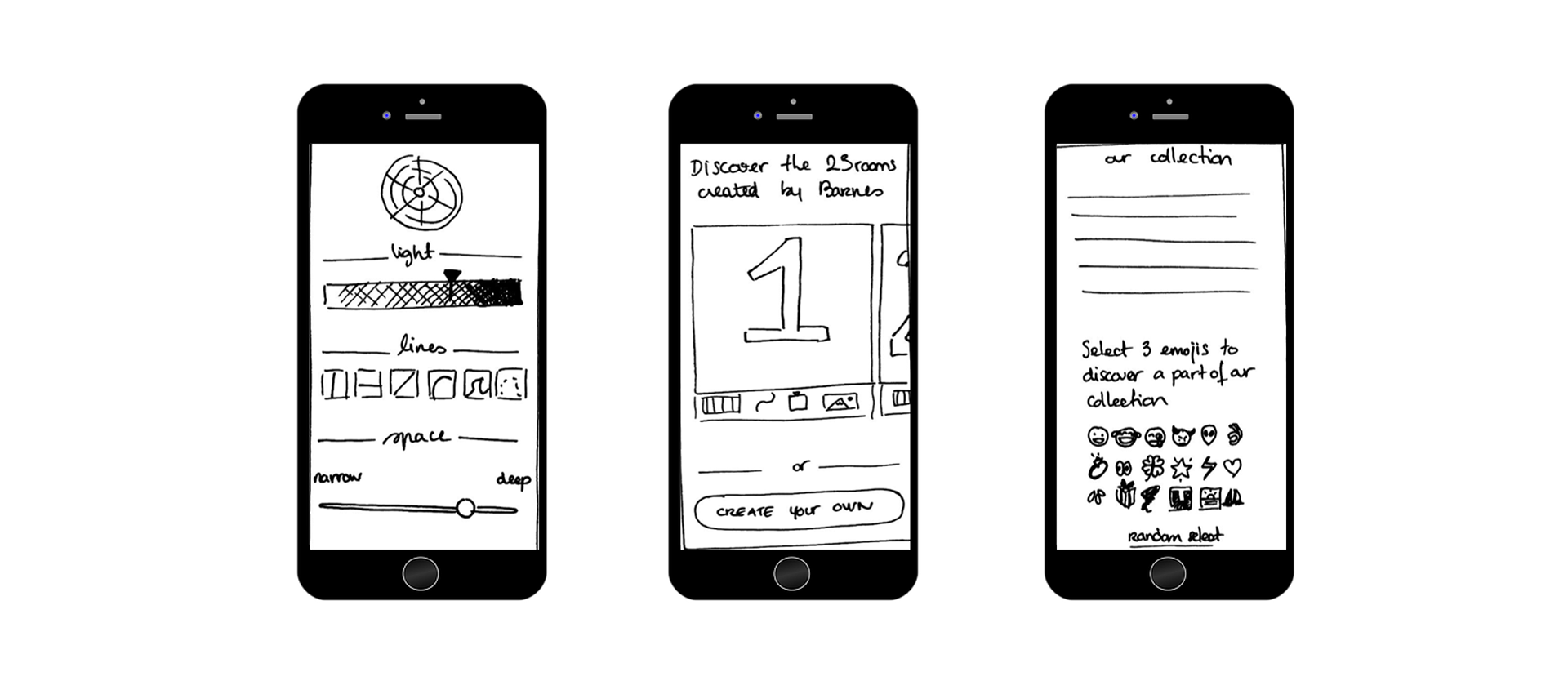
The first step of the project was to present the design team a wide range of possibilities. Some examples we thought about, an immersive wall of images, to explore by current rooms of collection, a search engine with random words… I even imagined an emoji based search.
We decided to move forward with visual filters search.


Filtering system
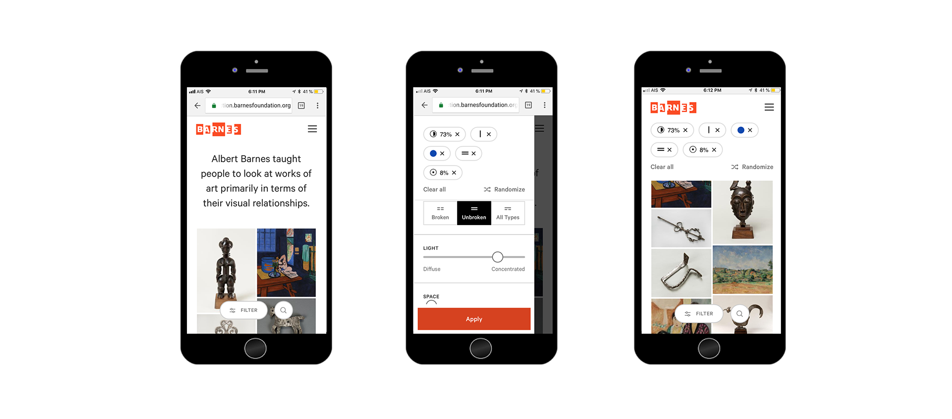
When the main flow was designed, the big challenge was the filters system itself.
Which visual elements to choose? And how to pick different elements in the most simple way?
Lines for example: they can be horizontal, verticals, curved, straight, cutted… We could also talk about spaces (narrow to deep), lights changes…
For each type of filters, there is a different logic.
Through some iterations we opted for the most intuitive options in each field.

An easy & non frustrating mobile navigation was a priority for us. Everyone could be able to try this tool and discover a new way to browse art.
Visually Related Artworks
Another Challenge was the navigation from a Detail Page.
From an artwork page, we wanted to display “related” artworks, with a gauge allowing user to play with “very similar” to “more surprising” artworks.
For once, you don’t need to be a “connoisseur” to enjoy browsing an online art collection.


