Sonia Rykiel
Agency: AREA 17
Year: 2017
Key points:
- Information architecture
- Product page inspired from magazines
- Displaying runway looks
- High templating constraints
To support its omnichannel strategy, the iconic Parisian fashion house gets a brand new e-commerce website, connecting products with services and storytelling.
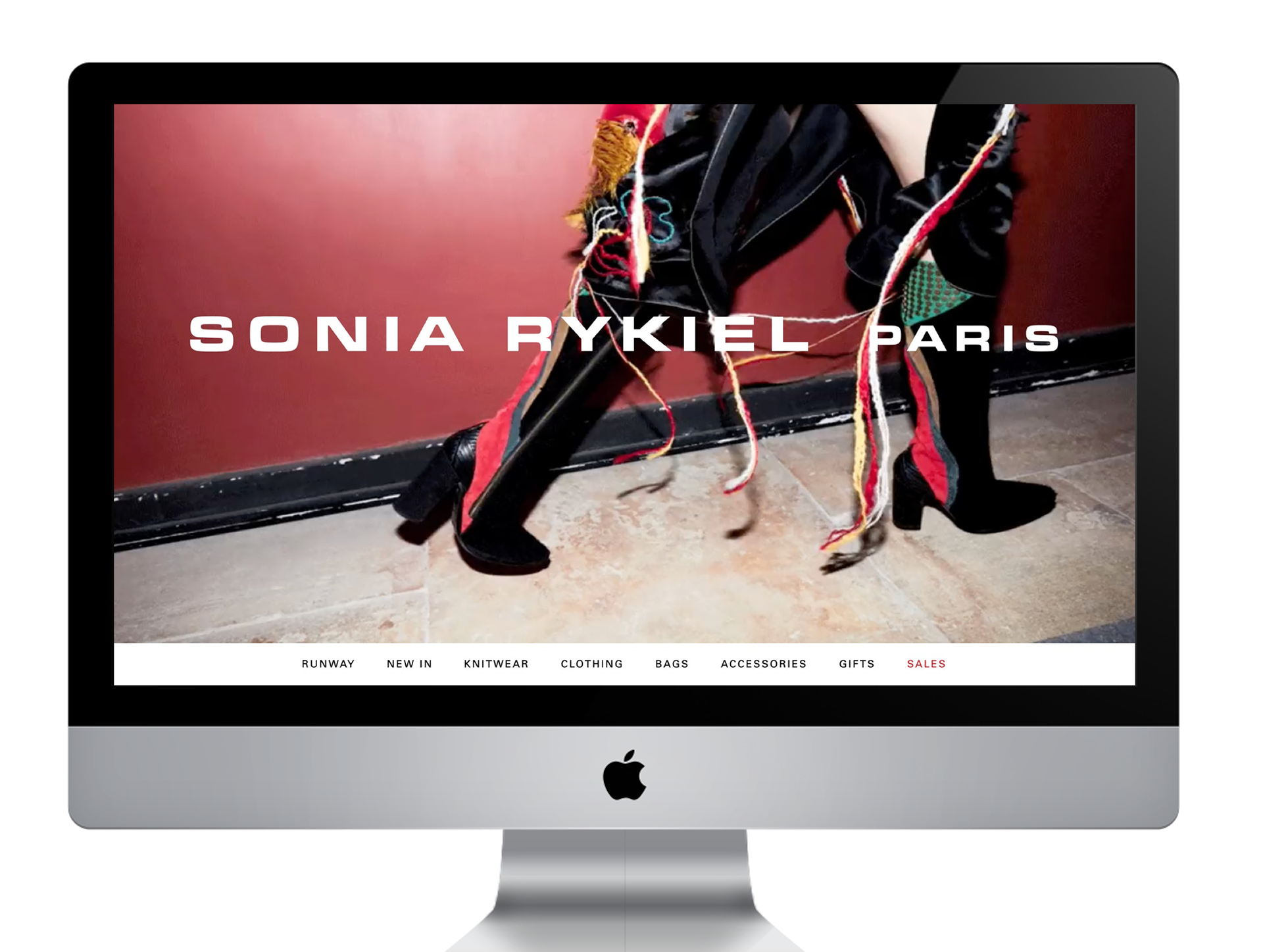
Editorialized content
One of the main challenges of this project was to find a balance between brand content & straightforward online shopping. Luckily, the historic fashion house has a lot of storytelling around iconic products.
Here is some initial thinking around the homepage, on how to present the new collection, and showcase some products or tendencies, and still be efficient as an e-commerce website.
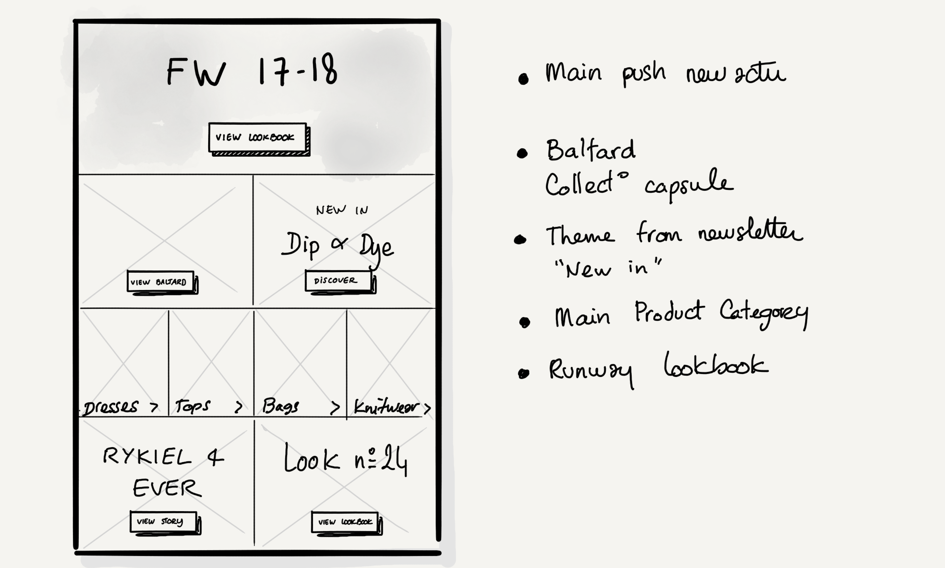
…still efficient e-commerce
Enter with storytelling, but in the end, the product pages are key.
Here is an “editorialized product page”. We wanted to get rid of the traditional carousel, and the most important thing: display products in situation.
Ideally, bags close to hands, so we can see the real size. Clothes from different angles on a real person. Because the product alone isn’t enough to really see it.
On top of that, some storytelling can be added for special products: a focus on fabrics, or some “savoir-faire”, to explain the specificities of those luxury products.
Focus on Navigation
For a high-fashion brand, the goals are multiples.
First, the website must feature fashion shows & campaigns. Second, users must be able to buy online. Third, brand content is welcome (for SEO purposes). So it needs some flexibility, in order to display the “Sales”, or new Collection, but also structure. We want consistency, for brand image but also user comfort.
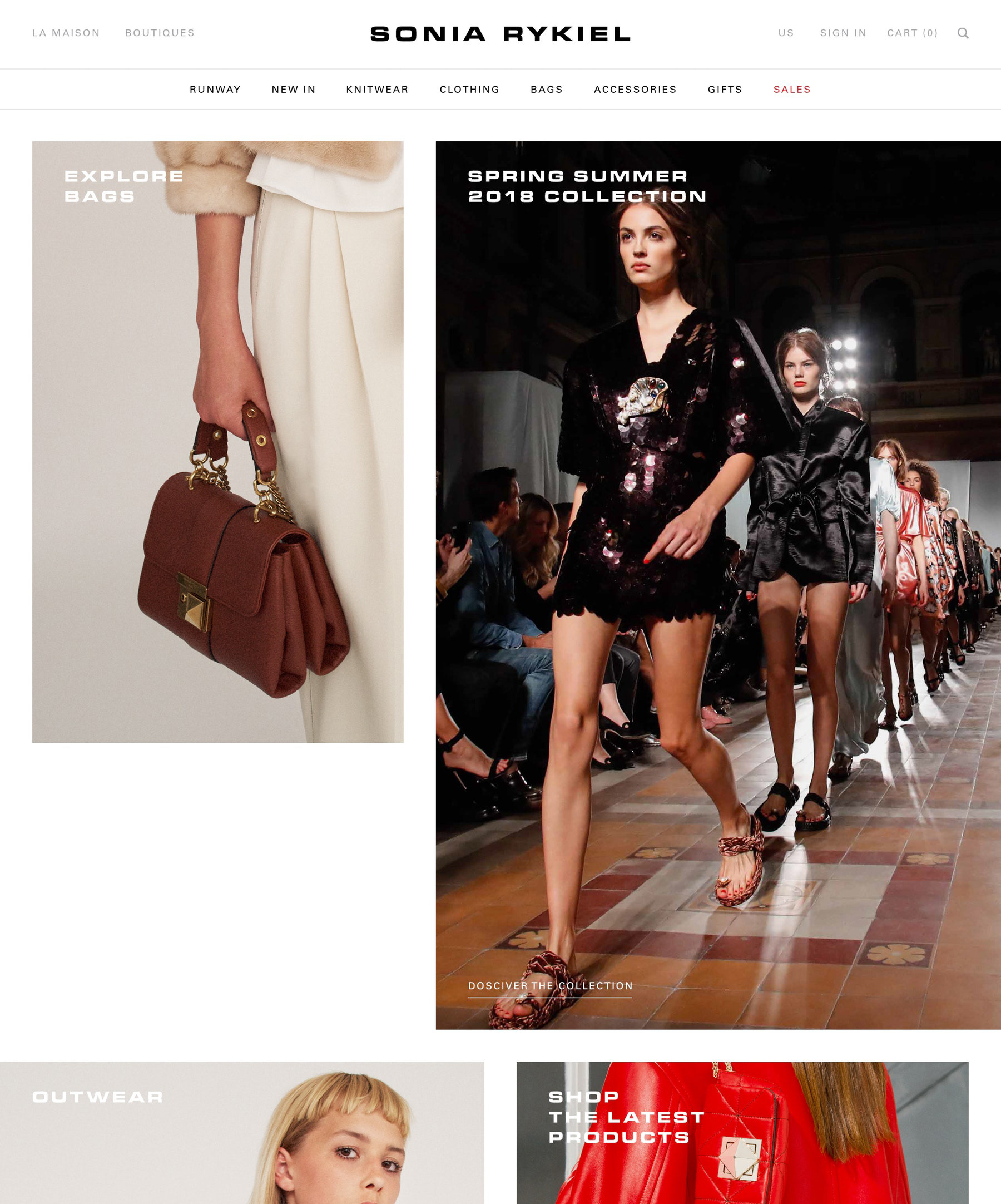
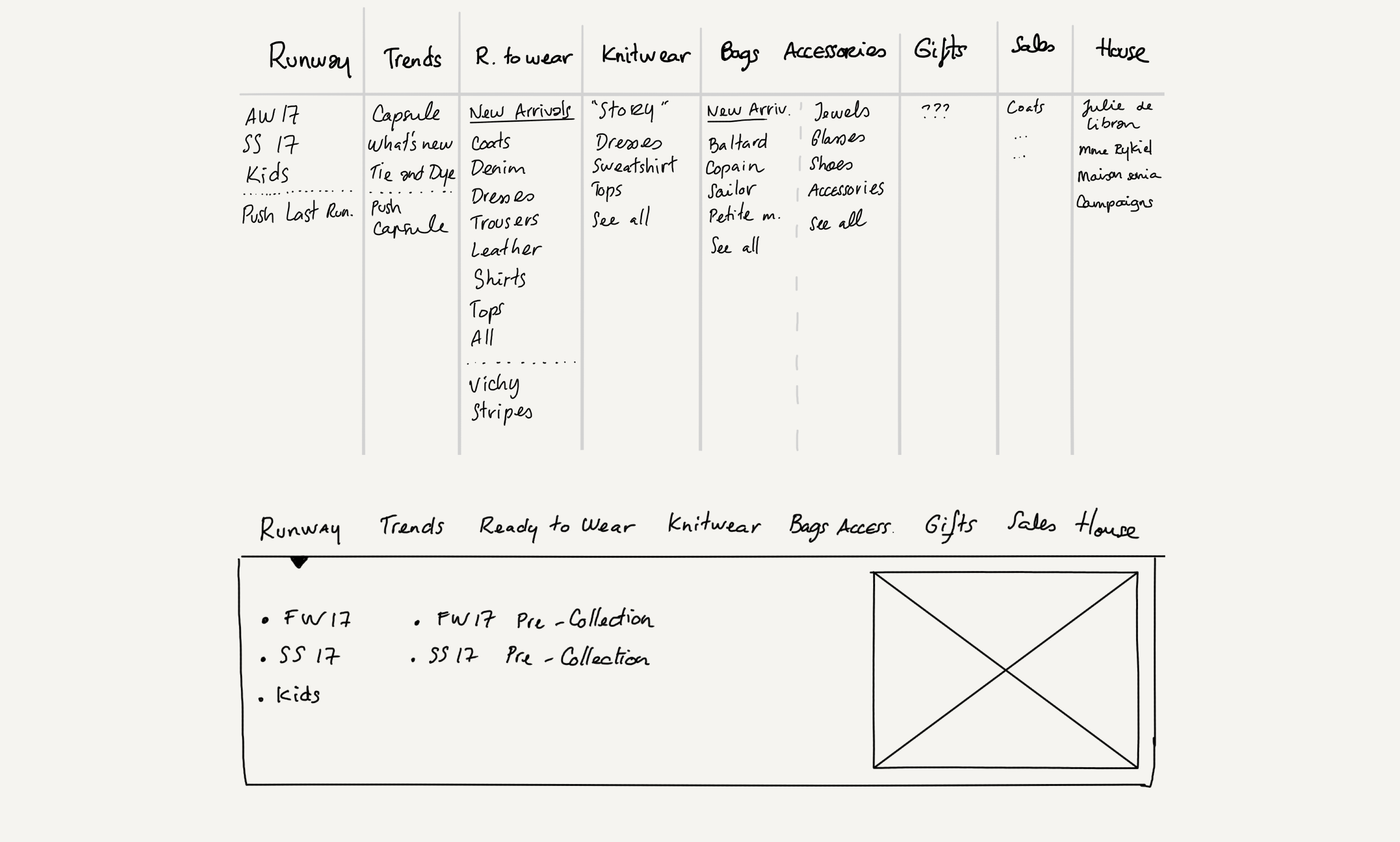
We wanted users to quickly look at the new collection, with Runway, and “New In” entries.
After this, all the main categories to shop online and Sales is ending the top navigation level.
On hover, there is an expand menu, you can see below the 1st draft of possibles categories we were thinking of… and what it looks like on graphic design.
A better view of the runway looks
An important side of Sonia Rykiel is, of course, fashion shows.
That’s why it has to be simple, fast to update for the brand, and also mobile-friendly.
Here is a runway lookbook example on mobile.
We suggested some innovations, see prototype below, to easily find the products used for the look.
One look is often several pieces chosen by a stylist, and having shortcuts to all products was something we presented to the client.
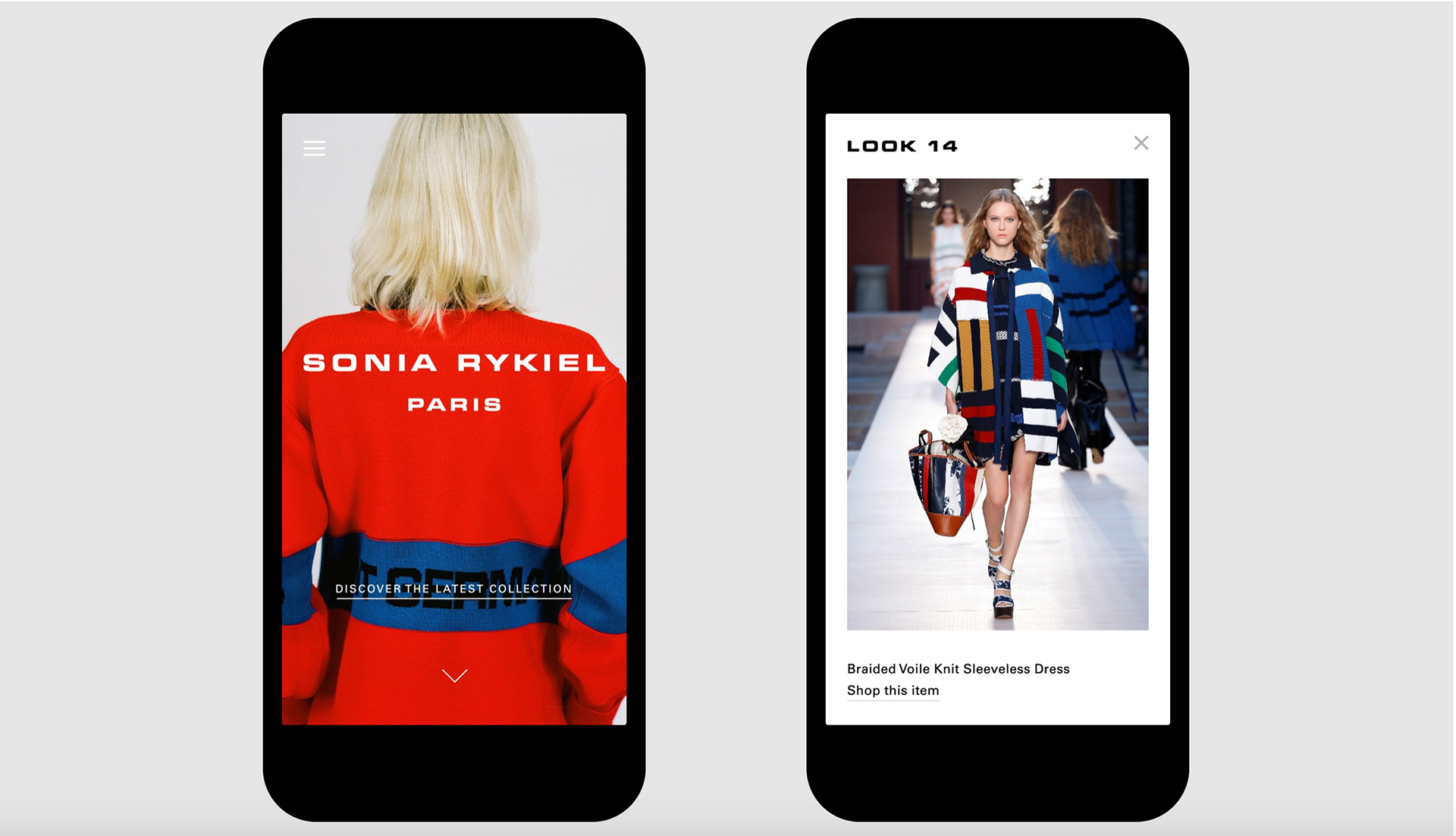
An elegant design that allows the brand to present the collection, from fashion shows to your cart.