Gladiabots
Goals :
- audit a video game’s current user interface
- identify pain points and provide recommendations
- design main screens to induce changes
- 15 hours of work
Gladiabots is an indie game available on iPad and desktop. I provided Interaction and UI recommendations for the iPad version, to enhance the player’s experience on this device.
Home Screen – After & Before comparison
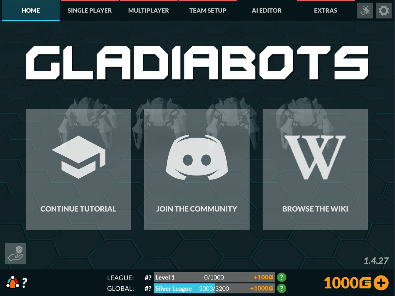
When you launch the game for the first time, the main actions you have are three external websites:
– Start Tutorial
– Access the Discord
– Browse the Wiki
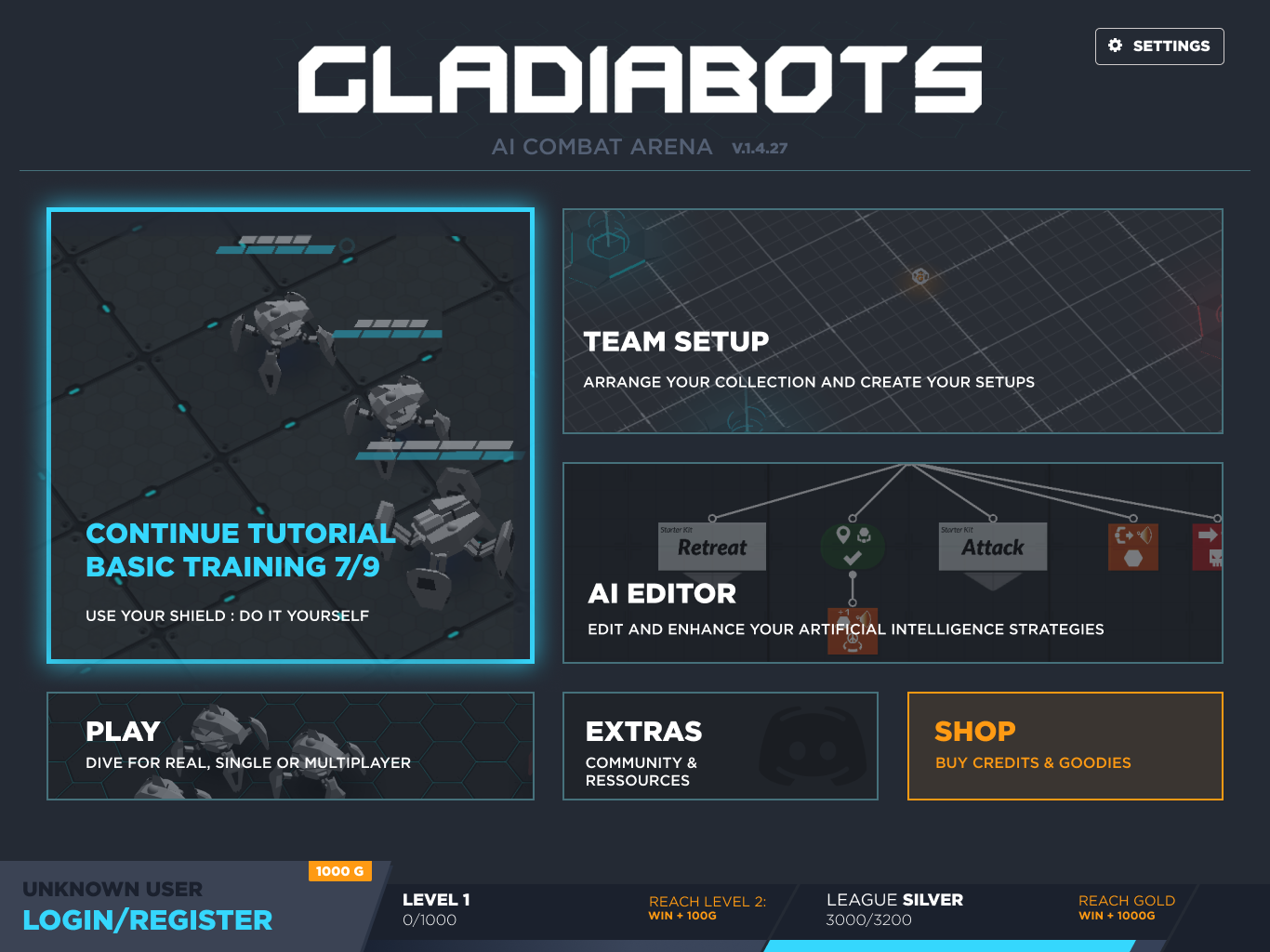
I decided to put a bigger emphasis on what’s available within the game first, with a big focus on tutorials and game modes, putting the Discord and Wiki in an extra entry.
Here is my redesign of the menu screen on iPad, the second image being the screen before my work.
Simplify AI configuration screen – After & Before
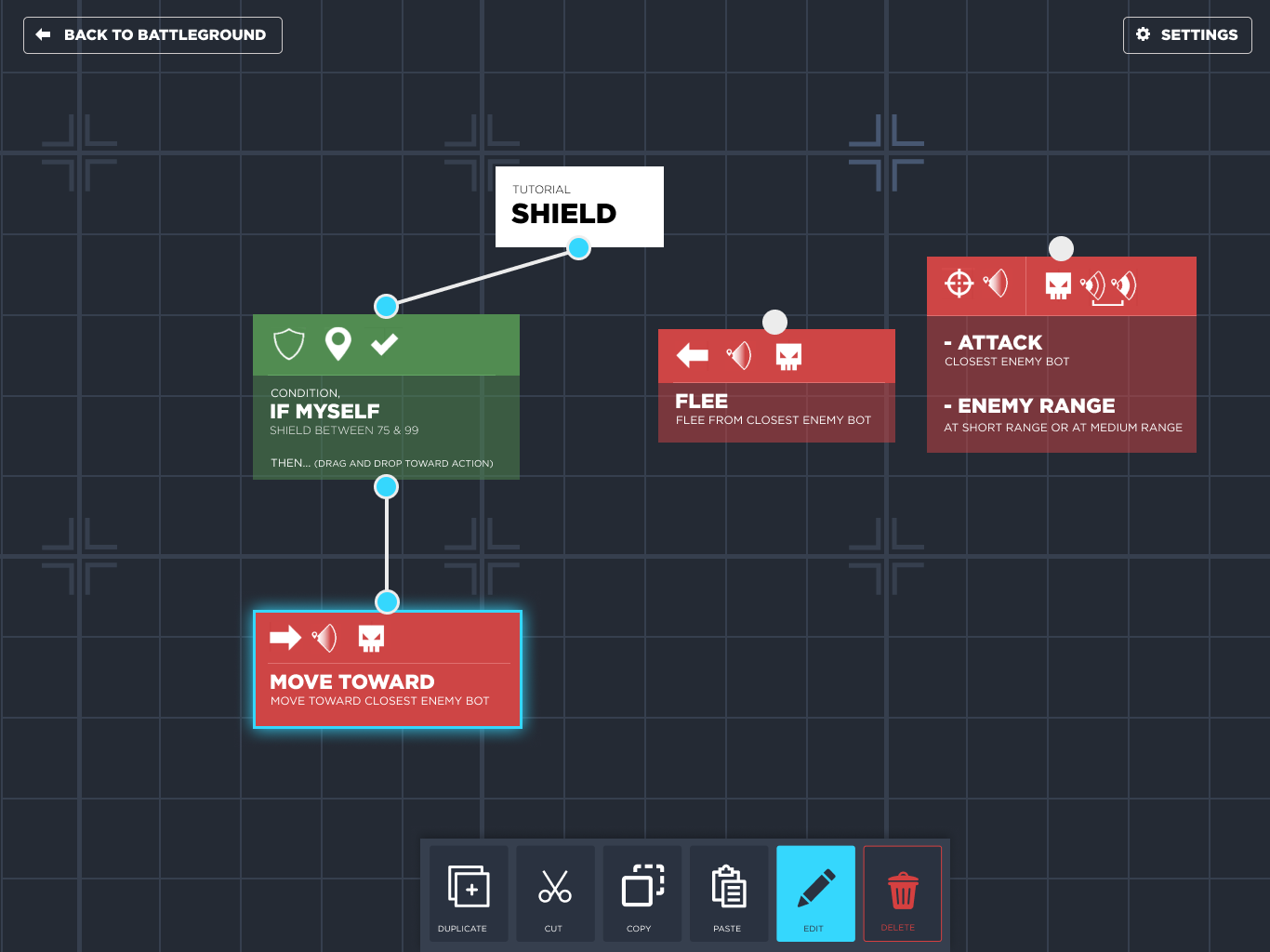
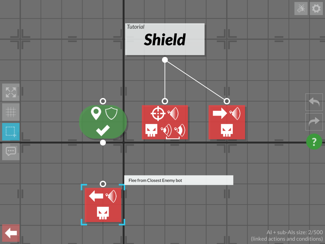
The main purpose of the game is to configure your tiny bots, fighting AI, to be able to vanquish other players or levels. The initial display of actions for those AI was only relying on icons, comprehension could be tedious.
My suggestion was to clarify this screen explaining the condition and actions in words, to give context to those icons.
I also added labels for the edits icons, and change their position.
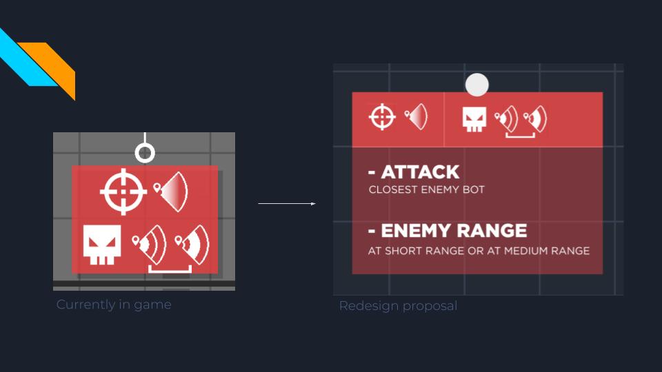
Again, my redesign versus the initial screen in the game.
Connexion flows
One amazing existent feature for the game was the ability to play without creating an account.
That being said, it you want to save your progression at some point, it’s better to create one.
I worked on a player’s flow for the account creation to improve and clarify those different states.
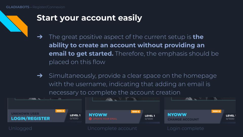
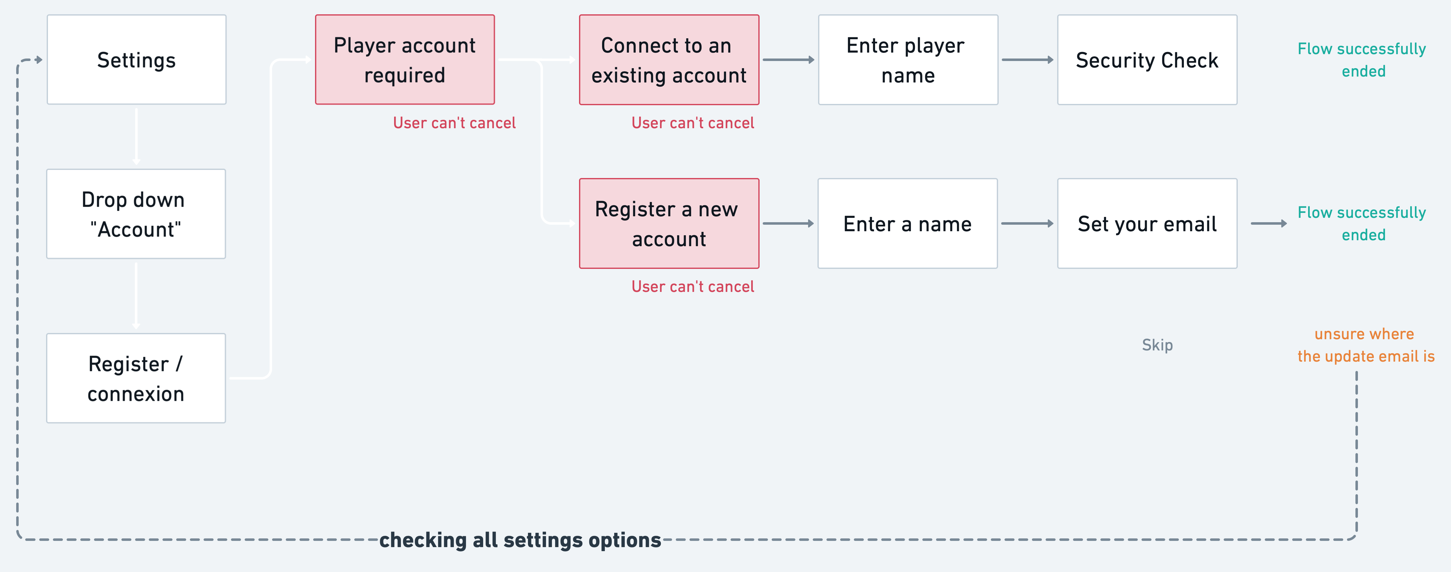
Designing UI for a coding bots game proved highly engaging, as ensuring the grid view’s clarity for player understanding and optimizing the home screen’s usability were paramount for players’ satisfaction.
